Understanding Pine Script’s plotshape() Function: A Comprehensive Guide
The plotshape() function is one of the most powerful visualization tools in Pine Script, allowing traders to highlight specific conditions on their charts with customizable symbols. Whether you’re developing a trading strategy or creating an indicator, mastering plotshape() can significantly enhance your technical analysis capabilities.
What is plotshape() in Pine Script?
The plotshape() function plots symbols on your chart at specific points based on conditions you define. It’s particularly useful for highlighting trading signals such as entry or exit points, making them visually striking and easy to identify on your charts.
Key Parameters and Syntax
The basic syntax of plotshape() in Pine Script version 5 is:
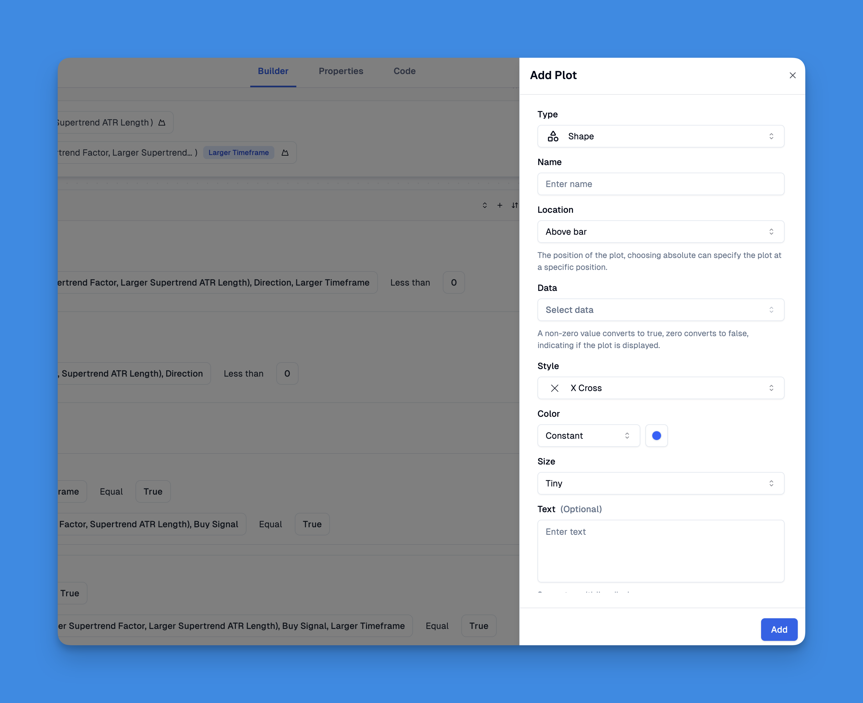
plotshape(series, title, location, color, style, size, offset, text, textcolor, editable, show_last, display, join, tooltip)
Essential parameters include:
- series (required): A boolean series where true conditions will display the shape
- title: The name of the shape series visible in indicator settings
- location: Determines where the shape appears relative to price bars (above or below)
- color: Specifies the shape’s color
- style: The shape’s style (circle, triangle, flag, etc.)
- size: Controls the shape’s size (small, normal, large)
- text: Optional text to display alongside the shape

Available Shape Styles
Plotshape() offers various shape styles to choose from:
- shape.xcross
- shape.cross
- shape.circle
- shape.triangleup
- shape.triangledown
- shape.flag
- shape.arrowup
- shape.arrowdown
- shape.square
- shape.diamond
- shape.labelup
- shape.labeldown
Visualizing Trading Signals: Leveraging plotshape() Without Coding
The plotshape() function is one of Pine Script's most powerful visualization tools, allowing traders to mark significant points on charts with customizable shapes and characters. While traditionally requiring coding knowledge, platforms like Pineify have revolutionized how traders can implement this functionality without writing a single line of code.
Through Pineify's intuitive visual interface, you can easily create indicators that use shape plotting to highlight trading signals, such as entry and exit points, directly on your TradingView charts.
Website: Pineify
Click here to view all the features of Pineify.Practical Example: MA Crossover Indicator
Here’s a simple example showing how to use plotshape() to highlight bullish signals when a fast moving average crosses above a slow moving average:
//@version=5
indicator("MA Crossover Shapes", overlay=true)

// Define moving averages
fastMA = ta.sma(close, 9)
slowMA = ta.sma(close, 21)

// Crossover condition
bullishSignal = ta.crossover(fastMA, slowMA)

// Plot shapes for bullish signals
plotshape(
    bullishSignal,
    title="Bullish Signal",
    location=location.abovebar,
    color=color.green,
    style=shape.triangleup,
    size=size.small
)
This code creates green triangles above price bars whenever the fast MA crosses above the slow MA, providing a clear visual signal for potential buying opportunities.
Best Practices for Using plotshape()
- Use appropriate shapes for different signals (triangles for direction, circles for neutral indicators)
- Choose contrasting colors to make your shapes stand out against the chart background
- Consider location carefully - place buy signals above bars and sell signals below for clarity
- Combine with text when additional information would be helpful
- Keep it simple - too many shapes can make your chart cluttered and difficult to interpret
Advanced Techniques
Displaying text with shapes: You can add descriptive text alongside your shapes to provide additional context:
plotshape(
    bullishSignal,
    title="Buy Signal",
    text="BUY",
    location=location.abovebar,
    color=color.green,
    style=shape.triangleup,
    size=size.small
)
Conditional coloring: Make your shapes adapt to market conditions:
plotshape(
    signal,
    title="Signal",
    color=signalStrength > 70 ? color.green : color.yellow,
    style=shape.circle,
    size=size.normal
)
When to Use plotshape() vs. Alternatives
- Use plotshape() when you need predefined shapes with optional text at specific bar locations
- Use plotchar() when you only need to display a single character
- Use plotarrow() specifically for up/down arrows without text
- Use label.new() when you need dynamic text that can change during script execution
- Use table.new() when your text isn’t tethered to specific bars
Conclusion
The plotshape() function is an essential tool for Pine Script developers looking to create visually informative indicators. By mastering this function, you can transform complex trading signals into clear visual cues that enhance your trading decisions.