Enhancing Visual Analysis with Pine Script: Filling Between Lines
Pine Script, a powerful tool for creating custom indicators and strategies on TradingView, offers a variety of functions to enhance visual analysis. One of the most useful features is the ability to fill the background between two lines, which can significantly improve the readability and effectiveness of your charts. In this article, we’ll explore how to use the fill() function to create shaded areas between plots or horizontal lines, and how this can benefit your trading or analysis workflow.
Understanding the fill() Function
The fill() function in Pine Script is designed to create shaded areas between two plots or horizontal lines. This is particularly useful for highlighting trends, indicating channels, or distinguishing between different zones on your chart. The function requires the IDs of the two lines you want to fill between, along with a color specification.
Syntax Overview
The fill() function has two main signatures:
- For Horizontal Lines:
fill(hline1, hline2, color, title, editable, fillgaps, display) - For Plots:
fill(plot1, plot2, color, title, editable, show_last, fillgaps, display)
Here’s a breakdown of the parameters:

hline1andhline2(orplot1andplot2): IDs of the horizontal lines or plots returned byhline()orplot()functions.color: The color used for filling. You can usecolor.new()to specify the color and opacity.title: Optional title for the fill object.editable: Whether the fill object can be edited interactively.fillgaps: For plots, whether to fill gaps in the data.show_last: For plots, whether to show the fill only for the last bar.display: Whether the fill object should be displayed.
Simplifying Complex Visual Indicators Without Coding Skills
Creating visual indicators with filled areas in Pine Script requires coding knowledge. While these elements help highlight important chart patterns and zones, many traders find implementation challenging. Pineify solves this by providing a no-code solution for creating visual indicators on TradingView.
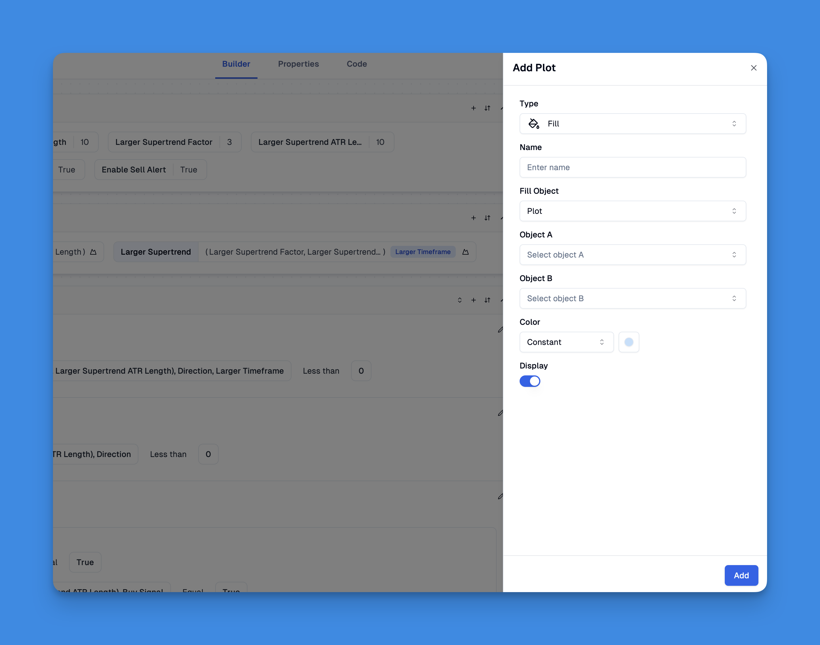
Pineify makes it easy to add visual elements to your trading charts without any coding. Using its simple editor, you can create filled areas between lines, add different types of charts (like lines and histograms), and include colors and shapes. This helps turn numbers and data into clear visual patterns that are easy to understand at a glance.
Website: Pineify
Click here to view all the features of Pineify.Practical Applications of Filling Between Lines
Filling between lines can be incredibly useful in various trading and analysis scenarios:
1. Highlighting Trends
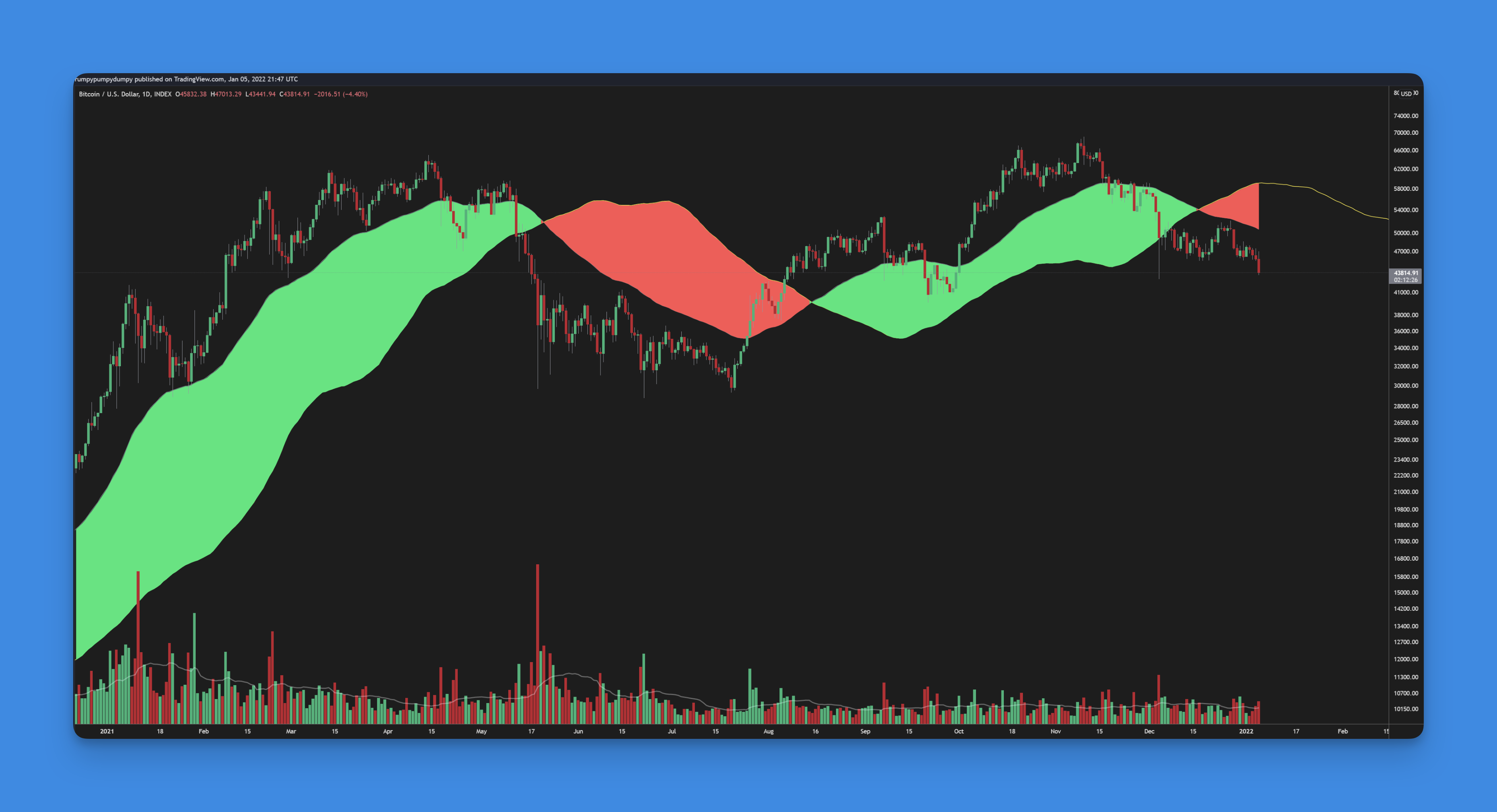
- Moving Averages: Fill between two moving averages to visually identify when one crosses over the other, which can be a key trading signal.
- Channels: Use fills to highlight channels formed by trend lines, helping you identify potential breakouts or reversals.
2. Visualizing Oscillators
- Fill between an oscillator plot and a zero line to quickly see when the oscillator is above or below zero, which can indicate overbought or oversold conditions.
3. Custom Indicators
- Create custom indicators by filling between lines that represent different conditions or thresholds, making it easier to interpret complex data.
Example Code Snippet
Here’s a simple example of how to use the fill() function to shade between two horizontal lines:
//@version=5
indicator("Example", "", true)

// Create horizontal lines
hline1 = hline(0)
hline2 = hline(1.0)

// Fill between the lines
fill(hline1, hline2, color.new(color.yellow, 90))
Conclusion
Using the fill() function in Pine Script can significantly enhance your chart analysis by visually highlighting important areas. Whether you’re a trader looking to identify trends or an analyst seeking to present data more effectively, this feature offers a powerful tool to improve your workflow.