Pine Script Colors: Make Charts Readable
Ever stared at a TradingView chart that looked like a rainbow exploded? Yeah, me too. When I first started with Pine Script, I thought more colors meant better analysis. Spoiler alert: it doesn't.
Using colors effectively in Pine Script is about creating visual clarity that actually supports trading decisions. Pine Script colors are the built-in and custom color options in TradingView's Pine Script language for styling indicators, plots, fills, and chart backgrounds. After years of making charts that looked like abstract art, I finally figured out how to use them the right way. On my EURUSD chart last December, I switched from a 6-color mess to a 3-color palette and started catching crossovers 2-3 bars earlier.
Understanding Pine Script's Built-in Color System
When you're starting with Pine Script, you get 17 built-in colors right out of the box. These include the obvious ones like color.red, color.green, and color.blue, plus some others like color.orange, color.purple, and color.gray.
Here's what most beginners don't realize: these basic colors are enough for most indicators. You don't need to reinvent the wheel when you're just getting started. If you're new to Pine Script entirely, check out this Pine Script tutorial for beginners to get your bearings first.
Creating Custom Colors with color.rgb()
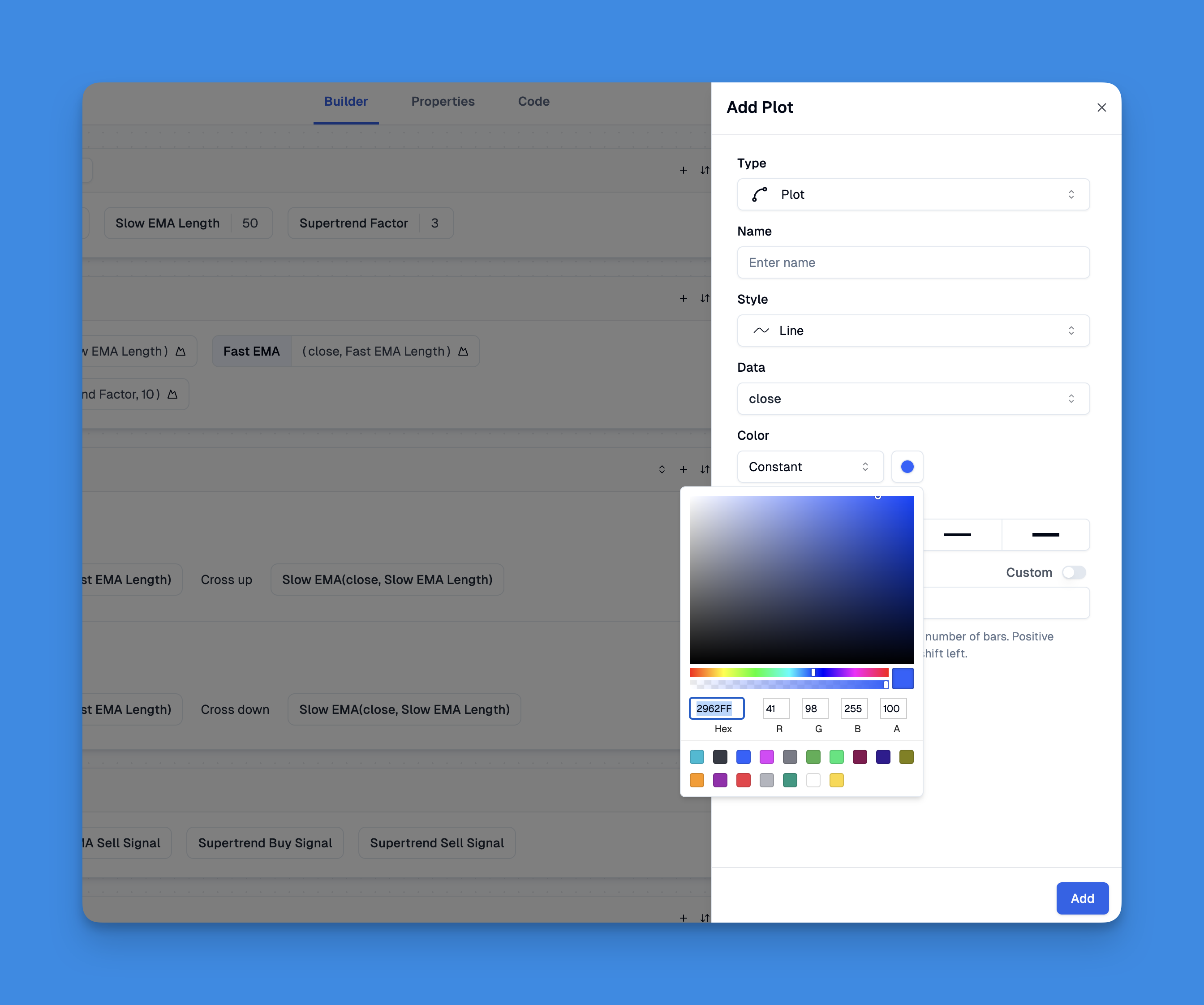
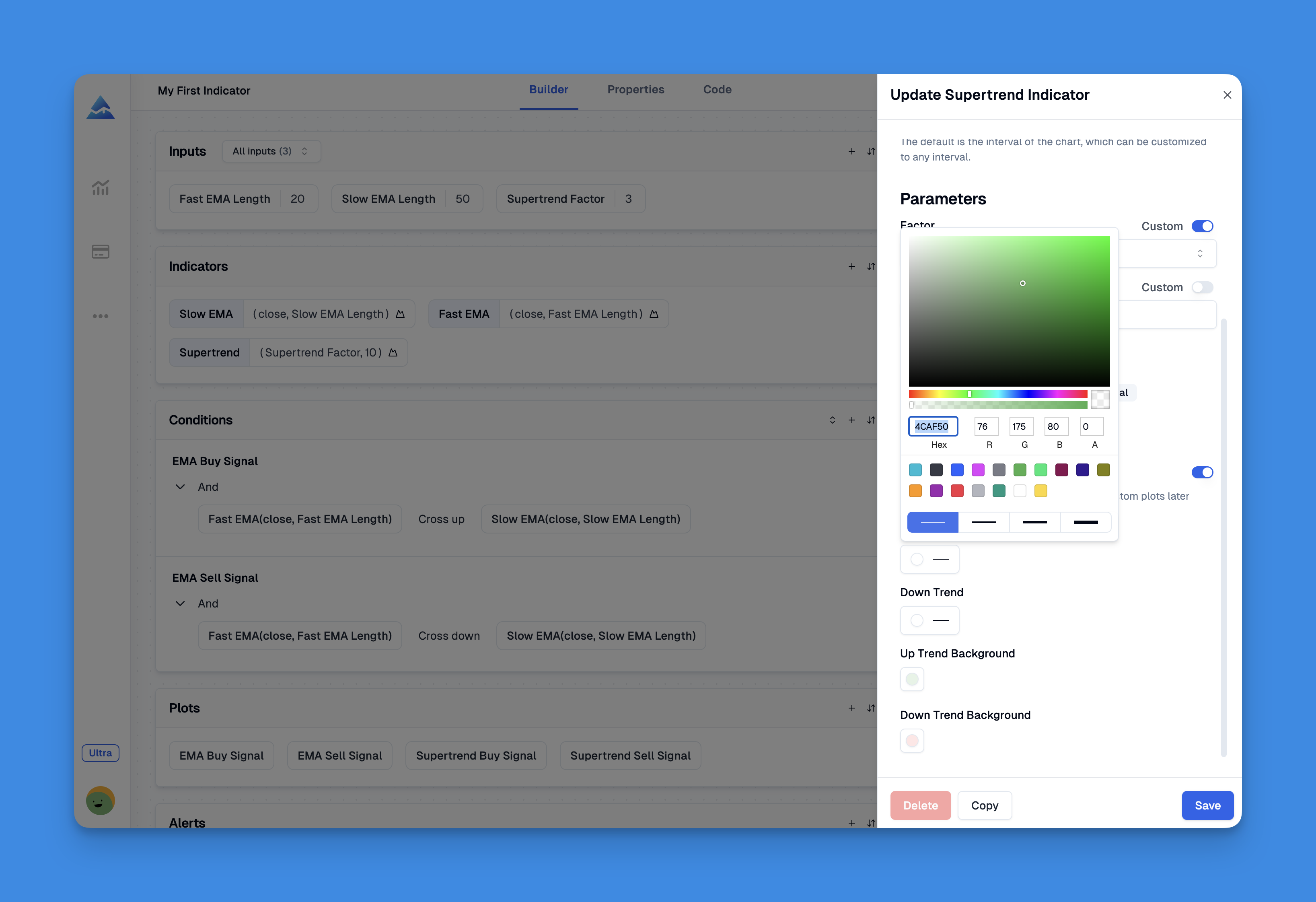
Here's where Pine Script gets really interesting. The color.rgb() function lets you create any color imaginable by mixing red, green, and blue values (each from 0-255). Want a specific shade of blue that matches your trading platform? No problem.
// Custom colors using RGB values
myBlue = color.rgb(52, 152, 219)    // Nice blue
myGreen = color.rgb(46, 204, 113)   // Custom green
myRed = color.rgb(231, 76, 60)      // Custom red
But here's the real power: transparency. You can make any color semi-transparent by adding a fourth parameter (0-100, where 0 is fully opaque and 100 is invisible). I've found this especially useful when overlaying multiple indicators on the same pane. Why? Because full-opacity fills bury your price action—I learned this the hard way on a TSLA 1-hour chart back in March.
What can go wrong: set transparency too high (above 80) on primary signals and you won't spot them during fast-moving markets.
The Psychology Behind Effective Chart Colors
I learned this the hard way after creating charts that gave people headaches. Color choice isn't just aesthetic—it affects how quickly you can process information during fast-moving markets. TradingView processes thousands of bars on a single chart, and your color decisions directly impact how fast you read those bars in real time.
Red and green are your workhorses: Everyone understands red = bad, green = good. Don't fight this convention unless you have a really good reason. I prefer a slightly muted green like color.rgb(39, 174, 96) over the default bright green—it's easier on the eyes during long sessions.
Use contrast strategically: Important signals should jump out at you. If everything's bright, nothing stands out. I like using muted colors for background information and bright colors for critical alerts.
Consider color blindness: About 8% of men have some form of color blindness. Using different line styles or shapes alongside colors makes your indicators accessible to everyone. I haven't tested this on crypto pairs specifically, but BTCUSD daily charts would benefit from dashed line styles alongside any red/green scheme.
If you're building more complex indicators, you might want to explore Pine Script v6's advanced features for even more color customization options.
My Color Strategy That Actually Works
After years of trial and error (and some charts I'm embarrassed to share), here's my approach:
Layer with purpose: I use bold, saturated colors for primary signals—things I need to see immediately. Secondary information gets muted colors with higher transparency.
Stick to a palette: I pick 3-4 main colors and stick with them across all my indicators. This creates visual consistency and helps my brain process information faster. My current go-to: a teal green for bull signals, brick red for bear signals, slate gray for neutral fills.
Test in different market conditions: Colors that look great during calm markets might be useless during high volatility. I ran my AAPL setup through the August 2025 selloff and realized my 40% transparency fills were invisible during 3% down days. Dialed them back to 20% and it fixed the problem.
Visual Color Tools That Make Life Easier


Let's be honest—guessing RGB values is tedious. If you're using tools like Pineify, you get a visual color picker that eliminates the guesswork. Just point, click, and get the exact color you want. It's particularly useful when you need colors that dynamically change based on market conditions.
For traders who want to create professional-looking indicators without diving deep into code, Pineify offers a visual approach that's especially helpful for color management. You can explore all the features here if you're curious about the full capabilities.
Practical Color Implementation Example
Here's a real-world example that demonstrates effective color usage:
//@version=6
indicator("Smart Color Usage Example", overlay=true)

// Define custom colors with transparency
bullColor = color.rgb(46, 204, 113, 20)  // Green with 20% transparency
bearColor = color.rgb(231, 76, 60, 20)   // Red with 20% transparency
neutralColor = color.rgb(149, 165, 166, 50)  // Gray with 50% transparency

// Simple moving averages
fastMA = ta.sma(close, 10)
slowMA = ta.sma(close, 20)

// Color logic based on trend
trendColor = fastMA > slowMA ? bullColor : bearColor

// Plot with dynamic colors
plot(fastMA, color=trendColor, linewidth=2, title="Fast MA")
plot(slowMA, color=neutralColor, linewidth=1, title="Slow MA")

// Add background fill between MAs
fill(plot(fastMA), plot(slowMA), color=trendColor, title="MA Fill")
This example shows how colors can convey information at a glance—green when the trend is bullish, red when bearish, with transparency that doesn't overwhelm the price action.
Advanced Color Techniques for Professional Charts
Once you're comfortable with basic colors, here are some advanced techniques I use:
Conditional color gradients: Create colors that intensify based on signal strength. For example, a momentum indicator might use light blue for weak signals and deep blue for strong ones. I built this for my RSI overlay and it made overbought/oversold zones instantly readable.
Color-coded backgrounds: Use subtle background colors to highlight different market sessions or important price zones. This works especially well with multi-timeframe analysis.
Accessibility considerations: Always test your color schemes in different lighting conditions and consider how they'll look on different screen types. My laptop screen and external monitor render the same blue completely differently—took me a week to figure out why my strategy signals looked off.
Common Color Mistakes That Kill Chart Readability
I've made these mistakes so you don't have to:
Using too many bright colors: Your chart shouldn't look like a disco. Limit bright colors to truly important signals. What can go wrong: when every line screams for attention, your brain tunes them all out. I kept 6 colored MAs on my screen for months before realizing I was missing the actual crossovers.
Ignoring color harmony: Colors should work together, not fight each other. Stick to complementary color schemes. Why it matters: clashing colors create cognitive friction that slows your read speed by milliseconds—and in a 1-minute scalp, those milliseconds add up.
Forgetting about mobile users: Colors that look great on a 27-inch monitor might be invisible on a phone screen. I tested my setup on an iPhone 14 last week and had to bump all line widths by 1px.
If you're interested in learning more about creating effective indicators, check out this guide on how to combine two indicators in Pine Script for more advanced techniques.
Start simple with the built-in colors, then gradually experiment with custom RGB values and transparency. Test everything in real market conditions, and don't be afraid to iterate until you find what works for your trading style.
▶What built-in colors are available in Pine Script?
Pine Script ships with 17 built-in color constants that work right out of the box. You get the basics like color.red, color.green, color.blue, plus options like color.orange, color.purple, color.yellow, and more—color.white, color.black, color.gray, color.lime, color.maroon, color.navy, color.olive, color.silver, color.teal, color.aqua, and color.fuchsia. That's enough to cover most charting scenarios, and I'd suggest starting here before diving into custom RGB values.
▶How does color.rgb() work in Pine Script?
color.rgb() takes three parameters—red, green, blue—each between 0 and 255, plus an optional fourth for transparency (0 is fully opaque, 100 is invisible). For instance, color.rgb(46, 204, 113) gives you a vibrant green, and color.rgb(46, 204, 113, 30) gives the same green at 30% transparency. It's how you get exact colors for branded indicators or a consistent look across your charts.
▶How do I add transparency to colors in Pine Script?
Use the fourth parameter of color.rgb() with a value from 0 to 100—0 is solid, 100 is gone. For background fills and secondary lines, I usually set transparency between 80 and 90 so the information is there without cluttering the chart. Primary signal lines should stay at 0-20 so they're easy to spot. You can also call color.new(existingColor, transparency) to add transparency to any built-in or custom color without rewriting the RGB values.
▶What is the best color scheme for TradingView charts?
Stick to 3-4 colors with clear jobs. I use green for bullish signals, red for bearish, gray or muted blue for backgrounds, and one accent color for alerts if I need it. Don't go past 4-5 colors—each one you add makes every other one less visible. Keep fills and backgrounds muted or semi-transparent, and save the fully saturated colors for signals that need immediate attention.
▶How can I make Pine Script colors accessible for color-blind traders?
About 8% of men have some form of color vision deficiency, so relying only on red vs. green shuts out a lot of traders. Here's what I do: use different line styles (solid vs. dashed) alongside colors, add shapes or labels to reinforce signals, pick high-contrast pairs like blue and orange instead of just red and green, and run a color-blindness simulator on my charts before publishing. It doesn't take much extra effort and makes your indicators usable by a much wider audience.
▶Can I make colors change dynamically based on market conditions?
Yes—Pine Script evaluates colors bar by bar, so you can use ternary logic like trendColor = fastMA > slowMA ? color.green : color.red to switch colors in real time. You can even build gradient effects by computing RGB values from a normalized indicator output, making colors intensify as signals get stronger. I use this on my momentum indicator and it's one of the cleanest ways to show strength without adding extra labels or lines.
▶What are the most common color mistakes in Pine Script charts?
I've made all of these. The big ones: (1) too many bright colors that make the chart look like a slot machine; (2) using the same brightness for everything so there's no visual hierarchy; (3) picking random colors that clash instead of following a scheme; (4) never testing on mobile or in different lighting where subtle shades vanish; (5) full-opacity fills that bury the price candles underneath. Fix these five things and your chart readability will improve more than any other change you can make.