Drawing or Plot Horizontal Lines in Pine Script: A Comprehensive Guide
Introduction
For traders and analysts using TradingView, Pine Script is a powerful tool for creating custom indicators and visualizations. One of the most useful features in Pine Script is the ability to draw horizontal lines, which can highlight key price levels such as support and resistance. In this article, we will explore how to use Pine Script to draw horizontal lines effectively, enhancing your trading strategies and market analysis.
Why Draw Horizontal Lines?

Drawing horizontal lines in Pine Script allows you to:
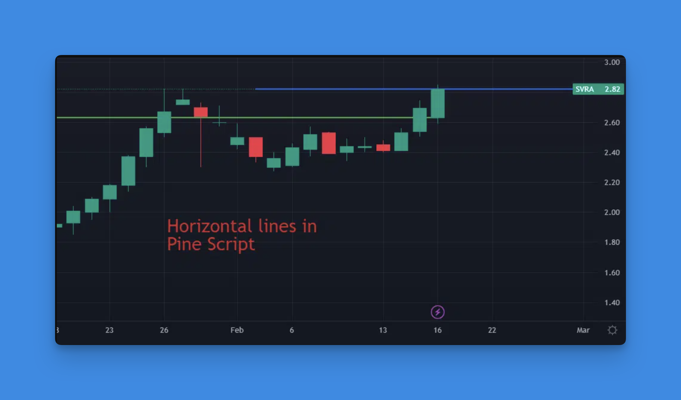
- Highlight Support and Resistance Levels: Identify crucial price points where the market tends to bounce back or break through.
- Visualize Trends: Use horizontal lines to illustrate trends or patterns in the market.
- Enhance Chart Readability: Simplify complex charts by marking important price levels.
Simplifying Horizontal Line Creation with No-Code Solutions
In the world of technical analysis, horizontal lines serve as critical visual markers for support, resistance, and other significant price levels. While traditional Pine Script coding requires understanding syntax and functions to create these lines, modern tools have revolutionized this process.
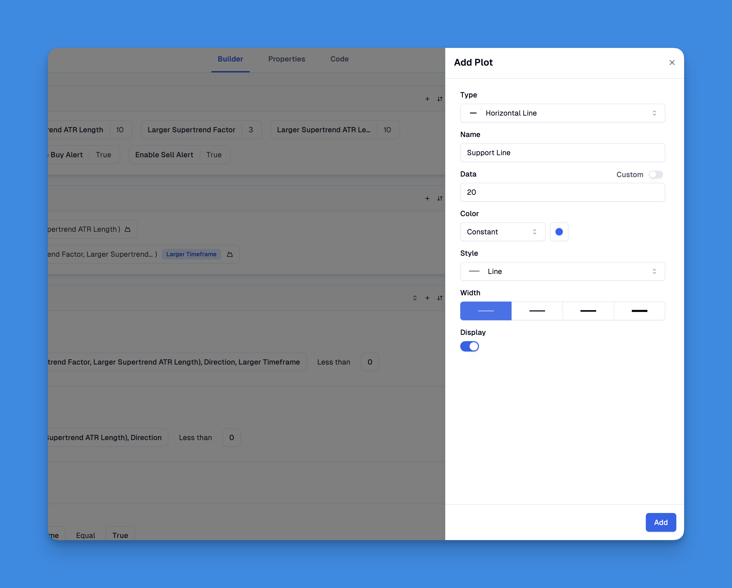
Pineify stands out as a powerful no-code solution that allows traders to draw and customize horizontal lines without writing a single line of code. Through its intuitive visual interface, users can easily plot horizontal lines at specific price levels, customize their appearance, and incorporate them into complex trading strategies.
Website: Pineify
Click here to view all the features of Pineify.How to Draw Horizontal Lines in Pine Script
Using the hline() Function
The hline() function is specifically designed for drawing horizontal lines at fixed price levels. Here’s a breakdown of its syntax and parameters:
hline(price, title, color, linestyle, linewidth, editable, display)
price: The price level at which the line will be drawn.title: A title for the line, useful for identification.color: The color of the line.linestyle: Can be solid, dotted, or dashed.linewidth: The thickness of the line.editable: Whether the line can be edited in the Format dialog.display: Controls where the line is displayed.
Example:
// This source code is subject to the terms of the Mozilla Public License 2.0 at https://mozilla.org/MPL/2.0/
// © Pineify

//======================================================================//
//                    ____  _            _  __                          //
//                   |  _ \(_)_ __   ___(_)/ _|_   _                    //
//                   | |_) | | '_ \ / _ \ | |_| | | |                   //
//                   |  __/| | | | |  __/ |  _| |_| |                   //
//                   |_|   |_|_| |_|\___|_|_|  \__, |                   //
//                                             |___/                    //
//======================================================================//

//@version=6
indicator("[Pineify - Best Pine Script Generator] Horizontal Line Example", overlay=true)
h1 = hline(20, "Support Level", color=color.blue, linestyle=hline.style_dashed)
Using the plot() Function
For more flexibility, you can use the plot() function to draw horizontal lines. This method allows you to plot lines that extend across the entire chart width.
plot(20)
This will draw a horizontal line at the price level of 20.
Advanced Techniques
Filling Between Horizontal Lines
To fill the area between two horizontal lines, you can use the fill() function:
// This source code is subject to the terms of the Mozilla Public License 2.0 at https://mozilla.org/MPL/2.0/
// © Pineify

//======================================================================//
//                    ____  _            _  __                          //
//                   |  _ \(_)_ __   ___(_)/ _|_   _                    //
//                   | |_) | | '_ \ / _ \ | |_| | | |                   //
//                   |  __/| | | | |  __/ |  _| |_| |                   //
//                   |_|   |_|_| |_|\___|_|_|  \__, |                   //
//                                             |___/                    //
//======================================================================//

//@version=6
indicator("[Pineify - Best Pine Script Generator] Filled Area Example", overlay=true)
h1 = hline(20)
h2 = hline(10)
fill(h1, h2, color=color.new(color.green, 90))
This script fills the area between two horizontal lines with a green color at 90% transparency.
Conclusion
Drawing horizontal lines in Pine Script is a straightforward yet powerful way to enhance your trading charts. By mastering the hline() and plot() functions, you can create more informative and visually appealing charts that help you make better trading decisions.