Plot Lines with Text in Pine Script: Complete Guide
Plotting lines with text in Pine Script means drawing visual line segments with line.new() and attaching descriptive labels using label.new(). It's how traders mark support, resistance, trend changes, and entry or exit signals directly on the chart. I've used this on AAPL and SPY daily charts to track swing levels, and it beats trying to remember why you drew a line three hours ago.
Sometimes a simple line isn't enough — you need to say what it means right there on the chart.
Pine Script Functions for Lines and Text Labels
Pine Script gives you three main tools for drawing on charts, and each has a different job.
plot() draws a continuous line across the entire chart. You can't control where it starts or stops, which makes it good for indicators but bad for marking specific levels.
line.new() gives you full control. You pick the start and end coordinates, choose colors, set line width, and extend the line in either direction. This is what you want for support, resistance, or trend lines.
label.new() puts text anywhere on the chart — at a specific price, at a bar index, or attached to one of your lines.
The trick is using them together. Most professional indicators use line.new() for precision and label.new() for context. I prefer keeping labels short — ticker and price — because long text blocks overlap with candles on smaller timeframes.
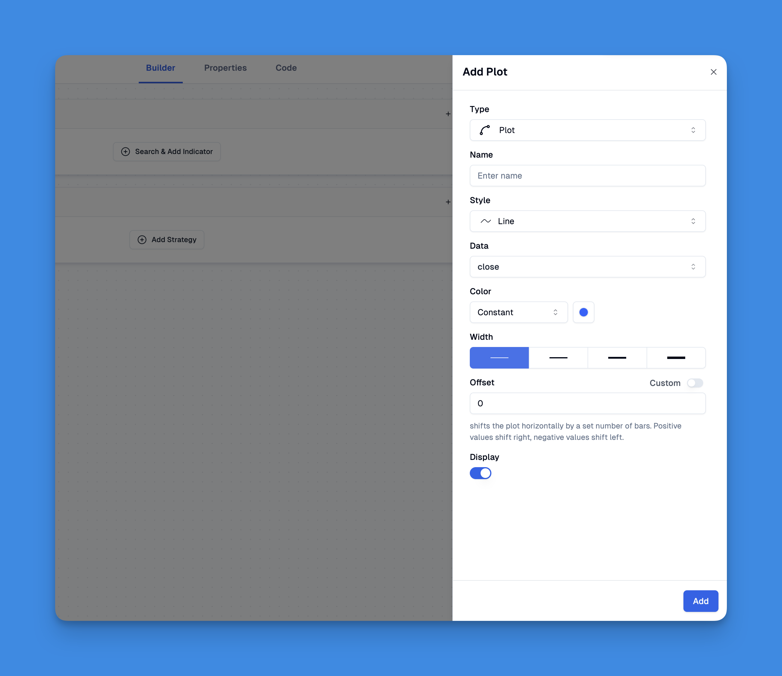
Creating Your First Line with a Text Label
Let's start with a horizontal line at the current close price, with a label showing the value. This is the most common annotation I reach for.
//@version=5
indicator("Price Line with Label", overlay=true)

if barstate.islast
    current_price = close

    // Draw the horizontal line
    price_line = line.new(
        x1=bar_index - 50,
        y1=current_price,
        x2=bar_index,
        y2=current_price,
        extend=extend.right,
        color=color.blue,
        width=2
    )

    // Add a text label
    price_label = label.new(
        x=bar_index,
        y=current_price,
        text="Current Price: " + str.tostring(current_price, "#.##"),
        style=label.style_label_left,
        color=color.white,
        textcolor=color.blue
    )
The barstate.islast guard matters here. Without it, Pine Script creates lines on every historical bar. On a 6-month daily chart that's roughly 130 lines you don't need. TradingView has a per-script object limit of about 50-60 labels by default, so running without this check will break your script silently — no error, just missing labels on recent bars.
What can go wrong: If you're using barstate.islast on a real-time chart, the line only redraws when a new bar closes. On lower timeframes like 1-minute, you might want a different approach — redraw on every tick instead, so the line follows price in real time.
Text Positioning and Styling
Pine Script labels have several position styles. Getting this right makes the difference between a readable chart and a mess.
label.style_label_up — text above the anchor. I use this for support levels. label.style_label_down — text below the anchor. Good for resistance so the label doesn't sit on price. label.style_label_center — centered on the anchor. Works for mid-line annotations. label.style_label_left/right — side positioning. I tend to avoid centered labels on busy charts; they obscure too many candles.
Here's how different positions look on the same chart:
//@version=5
indicator("Text Positioning Examples", overlay=true)

if barstate.islast
    high_line = line.new(bar_index-20, high, bar_index, high, color=color.red)
    low_line = line.new(bar_index-20, low, bar_index, low, color=color.green)
    mid_line = line.new(bar_index-20, (high+low)/2, bar_index, (high+low)/2, color=color.gray)

    // Different label positions
    label.new(bar_index, high, "Resistance: " + str.tostring(high, "#.##"),
              style=label.style_label_down, color=color.red, textcolor=color.white)

    label.new(bar_index, low, "Support: " + str.tostring(low, "#.##"),
              style=label.style_label_up, color=color.green, textcolor=color.white)

    label.new(bar_index, (high+low)/2, "Midpoint",
              style=label.style_label_center, color=color.gray, textcolor=color.white)
What can go wrong: On a 1-hour chart these styles work fine. Switch to 5-minute and the labels crowd each other out. I've had labels for resistance and support overlap when the range is narrow. One fix is conditional positioning — check distance between levels before placing the second label.
Dynamic Lines and Labels for Market Conditions
This is where Pine Script gets useful — lines that respond to what the market does. Here's a trend-line detector that draws and labels crossovers:
//@version=5
indicator("Dynamic Trend Lines", overlay=true)

// Detect potential trend changes
bullish_signal = ta.crossover(ta.sma(close, 20), ta.sma(close, 50))
bearish_signal = ta.crossunder(ta.sma(close, 20), ta.sma(close, 50))

if bullish_signal
    trend_line = line.new(bar_index, low, bar_index, high, color=color.green, width=3)
    trend_label = label.new(bar_index, low, "Bullish Crossover\nPrice: " + str.tostring(close, "#.##"),
                           style=label.style_label_up, color=color.green, textcolor=color.white, size=size.normal)

if bearish_signal
    trend_line = line.new(bar_index, high, bar_index, low, color=color.red, width=3)
    trend_label = label.new(bar_index, high, "Bearish Crossover\nPrice: " + str.tostring(close, "#.##"),
                           style=label.style_label_down, color=color.red, textcolor=color.white, size=size.normal)
When the 20 SMA crosses the 50 SMA, this draws a vertical line and a price label. I don't love using default SMA values on every symbol — on TSLA, the 20/50 crossover happens so often it's noise. I'd set these as inputs so you can tune them per ticker.
Why this pattern works: The line and label are created only on the signal bar, so old ones don't pile up. If you need to keep visible lines for multiple signals, you need array management (covered below).
Visual Option: Pineify
If debugging Pine Script syntax takes more time than analyzing markets, Pineify lets you build indicators with lines and labels through a drag-and-drop interface. You can prototype an idea in minutes, then export the code and tweak it.
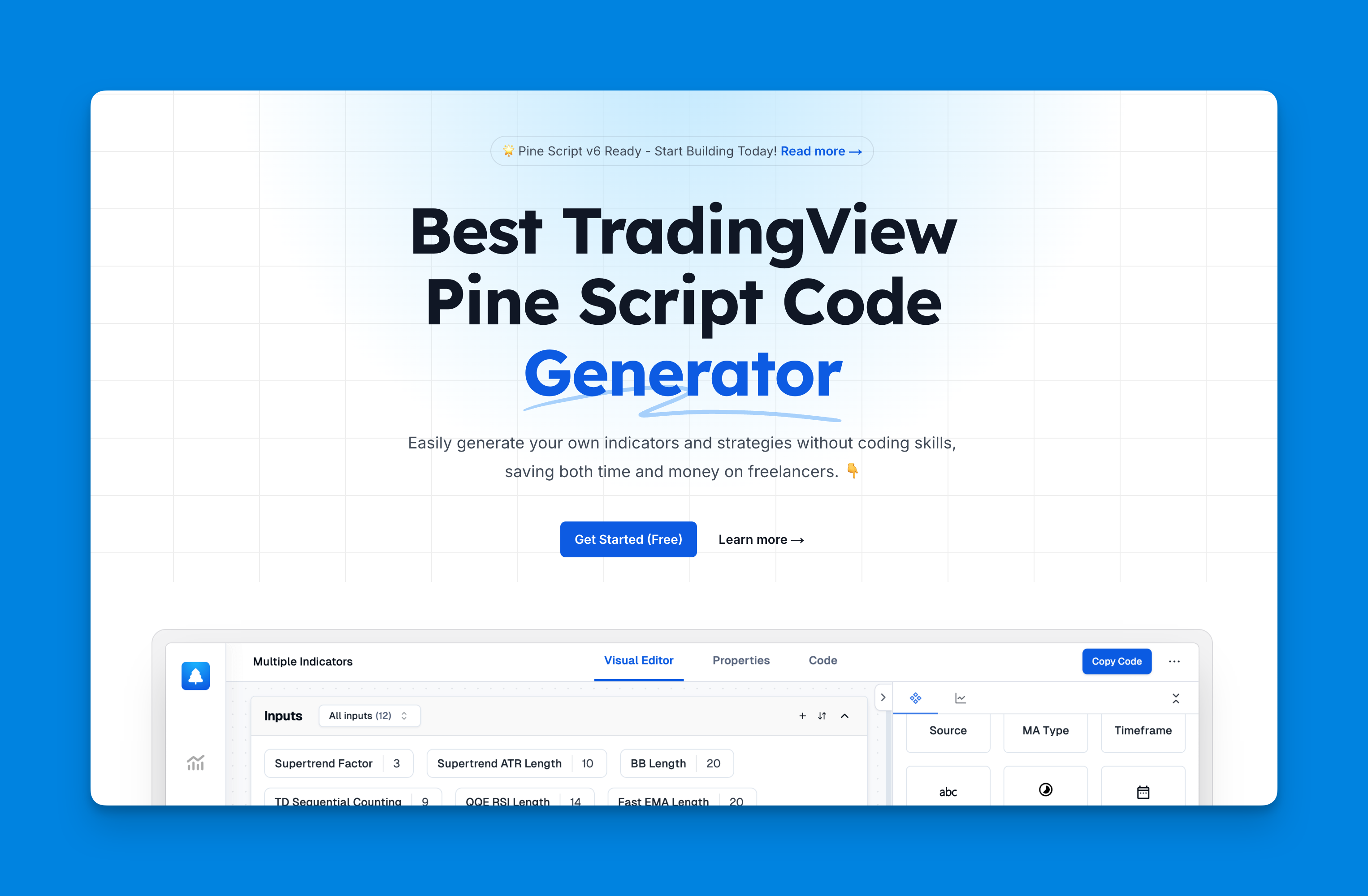
It's not a replacement for understanding the code — when a label doesn't show up where you expect, you still need to know how line.new() and label.new() work to fix it. But for quick experiments, it saves the syntax grind.

Managing Multiple Lines and Labels
Once you have more than a few annotation objects, you need structure. Here's the pattern I use:
//@version=5
indicator("Multi-Line Manager", overlay=true)

// Arrays to store our lines and labels
var line[] support_lines = array.new<line>()
var label[] support_labels = array.new<label>()

// Function to add new support level
add_support_level(price, bar_idx, description) =>
    new_line = line.new(bar_idx, price, bar_idx + 100, price,
                        color=color.blue, style=line.style_dashed)
    new_label = label.new(bar_idx + 50, price, description,
                         style=label.style_label_center, color=color.blue, textcolor=color.white)

    array.push(support_lines, new_line)
    array.push(support_labels, new_label)

// Detect support levels and add them
if ta.pivotlow(low, 5, 5)
    add_support_level(low[5], bar_index[5], "Support: " + str.tostring(low[5], "#.##"))
The array pattern lets you push new lines and labels, then clean up the oldest when you hit your limit. Without this, TradingView's 50-object default limit becomes a hard wall — your newest annotations stop appearing and there's no error to tell you why.
Why use functions here: Wrapping the line-and-label creation in a function keeps the signal detection clean. When I go back to a script six months later, I don't have to trace through duplicated line.new calls to find a bug.
Pro Tips for Better Line and Text Visualization
After working with Pine Script lines for a while, a few techniques made the biggest difference.
Use consistent color schemes — green for bullish, red for bearish, gray for neutral. I picked this up from a Pine Script beginner tutorial and it makes a chart readable at a glance. On TSLA I also use orange for options-related levels just to separate them from technical lines.
Control text size and transparency — size=size.small for secondary labels, color.new(color.blue, 70) for ghost lines. Big text works on a 4H chart but crowds the view on 15-minute. I haven't found a one-size-fits-all setting — I adjust per timeframe.
Clean up old objects — barstate.islast or time-based logic. Otherwise your chart turns into wallpaper.
Use line extensions — extend=extend.right shows where a level projects into the future. Without it, lines stop at the last bar and you lose the visual reference as price moves right.
What Goes Wrong and How to Fix It
When I first started adding text to lines, I tripped on these regularly.
Too many visual objects — Every line.new() or label.new() call uses memory. Create lines on every bar without cleanup and TradingView either stops drawing or slows to a crawl. The fix: delete old objects or use barstate.islast.
Timeframe blind spots — A label that's perfectly readable on a 1-hour chart is a blob on 5-minute. Test your annotations on the smallest timeframe you expect users to view. I learned this the hard way when my support labels covered the entire price column on a 3-minute ES chart.
Missing data values — If close is na, line.new() still runs but produces garbage. Wrap creation in if not na(close).
For more on chart annotations, here's a guide on drawing lines with Pine Script.
Real-World Example: Price Movement Tracker
Here's a script I use to annotate significant price moves on SPY. It draws a directional arrow and a percentage label for moves above a configurable threshold:
//@version=5
indicator("Price Movement Tracker", overlay=true)

// Settings
movement_threshold = input.float(2.0, "Movement Threshold %", minval=0.1, maxval=10.0)
show_percentages = input.bool(true, "Show Percentage Changes")

// Calculate price movement
price_change_pct = (close - close[1]) / close[1] * 100

// Detect significant movements
significant_up = price_change_pct > movement_threshold
significant_down = price_change_pct < -movement_threshold

if significant_up
    movement_line = line.new(bar_index[1], close[1], bar_index, close,
                            color=color.green, width=2, style=line.style_arrow_right)

    label_text = show_percentages ?
                 "↗ +" + str.tostring(price_change_pct, "#.##") + "%" :
                 "Significant Move Up"

    label.new(bar_index, close, label_text,
              style=label.style_label_lower_left, color=color.green, textcolor=color.white)

if significant_down
    movement_line = line.new(bar_index[1], close[1], bar_index, close,
                            color=color.red, width=2, style=line.style_arrow_right)

    label_text = show_percentages ?
                 "↘ " + str.tostring(price_change_pct, "#.##") + "%" :
                 "Significant Move Down"

    label.new(bar_index, close, label_text,
              style=label.style_label_upper_left, color=color.red, textcolor=color.white)
I set the threshold to 1.5% for SPY and 3% for individual stocks like AAPL. At 2%, SPY barely triggers, so the chart stays clean. On NVDA, 3% gives a dozen signals a day — I'd raise it to 5%. There's no universal setting, which is why movement_threshold is an input.
What can go wrong: This script creates a new line and label for every qualifying bar. On a volatile day with 30 signals, you'll hit TradingView's object limit. If that happens, add array management to delete the oldest labels.
Combining Techniques for Better Charts
Once you're comfortable with line.new() and label.new(), you can layer them with other drawing tools. box.new() creates rectangular zones with text labels, and plotshape() marks specific points without the object overhead.
I've been experimenting with combining horizontal lines for key levels and arrow labels for signals — they work well together on ES futures but overlap too much on crypto pairs with 20% daily ranges. The new Pine Script v6 features make managing these combinations easier with built-in limits.
▶What is the difference between line.new() and plot() for drawing lines in Pine Script?
plot() draws one continuous line through your entire chart history. You get no control over where it starts or ends. line.new() draws a single segment between two points you specify — exact x and y coordinates for start and end. You control color, width, style, and extension. Use plot() when you need a running indicator line. Use line.new() when you need to mark a specific price level at a specific bar.
▶How do I add a text label to a horizontal line in Pine Script?
Draw the line with line.new(), then call label.new() with the same y price value. Set x to the bar index where you want the label. Choose a style like label.style_label_left so the text sits to the side rather than on top of price bars. Both objects share the coordinate system, so matching the y parameter ties them visually.
▶Why should I use barstate.islast when plotting lines with text labels?
Without it, Pine Script executes drawing code on every historical bar. Each bar spawns its own set of line and label objects. TradingView caps script objects around 50-60 by default. You'll hit that limit fast and later labels silently stop appearing. barstate.islast restricts creation to only the last bar, keeping you under the limit.
▶How do I control where a text label appears relative to its anchor point?
Pick a label style constant. label.style_label_up puts text above (good for support so it doesn't cover the level). label.style_label_down puts text below (good for resistance). label.style_label_left and style_label_right push text to either side. label.style_label_center centers on the anchor but covers candles — I avoid it unless the area is empty.
▶How can I manage multiple lines and labels without hitting TradingView object limits?
Store line and label IDs in arrays with array.new<line>() and array.new<label>(). Before adding new ones, check the array length and delete the oldest with line.delete() and label.delete(). Alternatively, recreate everything on the last bar only — barstate.islast naturally caps your count at one set per bar.
▶Can I display dynamic values like price or percentage change inside a text label?
Convert numbers to strings with str.tostring() and concatenate them. For example: label.new(bar_index, close, "Price: " + str.tostring(close, "#.##")) shows the close price to two decimals. You can mix static text and multiple dynamic values to build any annotation you need.