Pine Script Transparent Color: A Quick Guide
Pine Script, TradingView’s scripting language, offers powerful tools to customize chart visuals, and one key feature is the ability to use transparent colors. Transparency in Pine Script allows traders and developers to create layered, visually appealing indicators and charts without cluttering the view. This article explains how to use transparent colors effectively in Pine Script, focusing on best practices and practical examples.
What Is Transparency in Pine Script Colors?
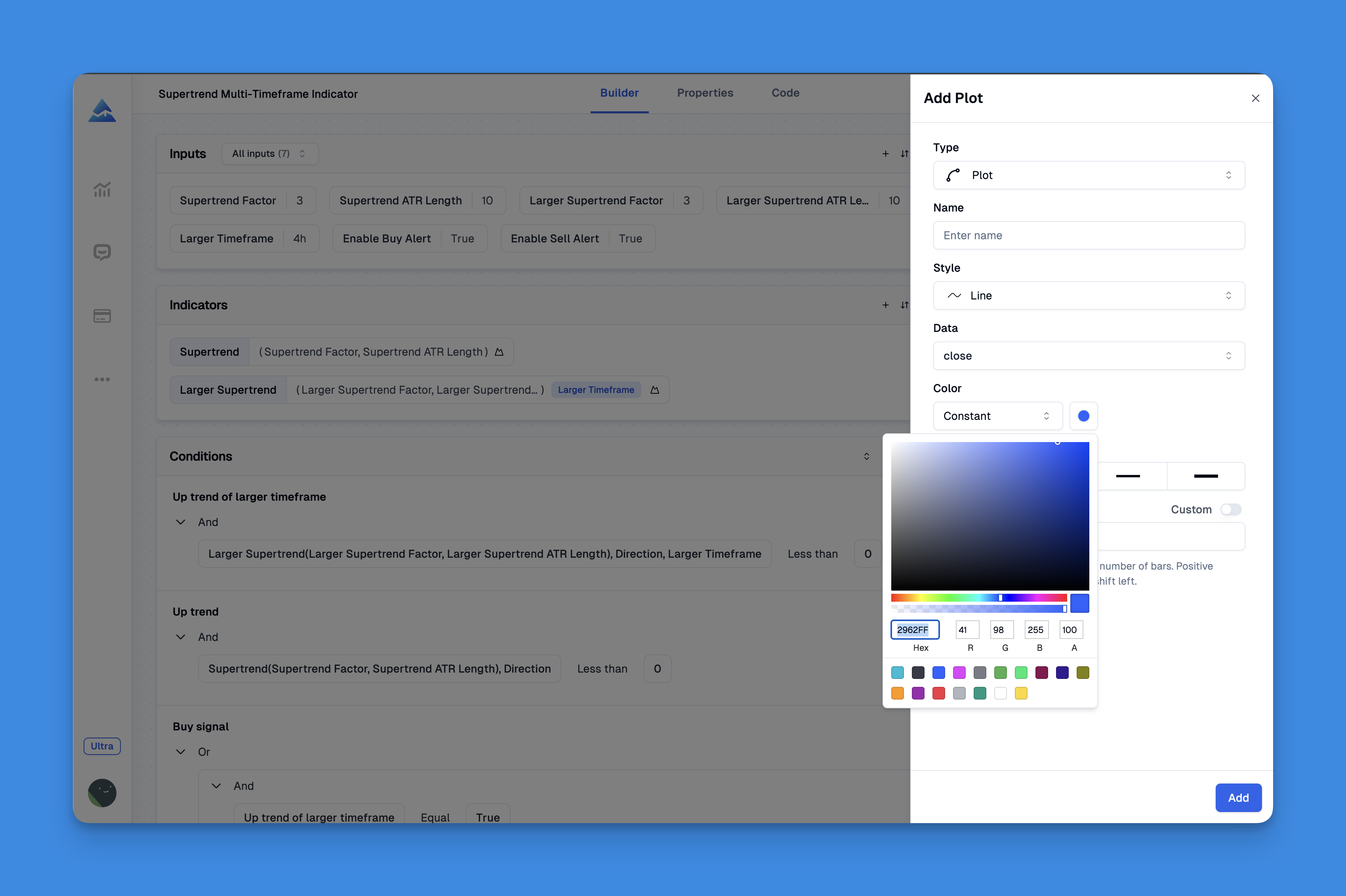
In Pine Script, colors are defined using the RGB model (red, green, blue), each ranging from 0 to 255. Transparency, often called the alpha channel, controls how opaque or see-through a color is. It ranges from 0 (fully opaque) to 100 (fully transparent, invisible). Adjusting transparency helps in layering chart elPine Script Transparent Color: A Quick Guide to Enhancing Your TradingView Chartsments so that important data stands out while less critical visuals fade into the background12.
How to Set Transparent Colors in Pine Script

Pine Script provides two main functions to create colors with transparency:
- color.new(color, transp): Applies a transparency level to an existing color.
- color.rgb(r, g, b, transp): Creates a custom color from red, green, blue values plus transparency.
Enhancing Chart Clarity with Transparent Colors and Custom Indicators
Enhancing your TradingView charts with transparent colors is not only about aesthetic improvement but also about achieving practical clarity in market analysis. Pine Script's flexible design allows traders to modify indicator visibility, enabling layered data that highlights trends without sacrificing usability.
Website: Pineify
Click here to view all the features of Pineify.Innovative platforms like Pineify have harnessed this potential by offering user-friendly, no-code tools that empower both beginners and experts to create, manage, and fine-tune a wide array of indicators. By integrating adjustable transparency settings, Pineify ensures that technical signals such as moving averages, oscillators, and support-resistance levels appear crisp against the backdrop of market charts, thereby easing the process of decision making.
Website: Pineify
Click here to view all the features of Pineify.Example Using color.new
//@version=5
indicator("Transparent Color Example", overlay=true)
plot(close, color=color.new(color.red, 50))  // Red color with 50% transparency
This code plots the closing price line in red with 50% transparency, allowing the price chart behind it to remain visible3.
Example Using color.rgb
//@version=5
indicator("Custom Transparent Color", overlay=true)
myColor = color.rgb(66, 25, 45, 50)  // Custom RGB color with 50% transparency
plot(close, color=myColor)
This creates a custom color with specified RGB values and 50% transparency45.
Why Use Transparency in Pine Script?
- Improved Visual Hierarchy: Transparent colors help highlight key data points while keeping other elements subtle.
- Layering Effects: Overlapping shapes or fills can blend smoothly without obscuring each other.
- Cleaner Charts: Transparency reduces visual clutter, making charts easier to read and analyze67.
Tips for Using Transparent Colors Effectively
- Avoid full transparency (100) unless you want the element invisible.
- Use moderate transparency (20-60) for backgrounds or fills to maintain visibility.
- Combine transparency with contrasting colors to emphasize important signals.
- Allow users to adjust transparency via input settings for personalized views89.
Conclusion
Mastering transparent colors in Pine Script elevates your TradingView indicators and charts, making them more insightful and visually appealing. Start experimenting with color.new() and color.rgb() functions today to add depth and clarity to your trading visuals. Share your custom transparent color scripts or questions in the comments below and join the community of Pine Script developers enhancing their charts with smart color use!