Pine Script Plot Text: A Comprehensive Guide
When creating custom indicators in TradingView using Pine Script, displaying text on your charts can significantly enhance your analysis. Whether you want to show price levels, trading signals, or important information, understanding how to plot text effectively is essential for any trader or developer.
Understanding Text Display Methods in Pine Script
Pine Script offers several ways to display text on your charts, each with its unique advantages:
plotchar() Function
The plotchar() function allows you to display a single character or a string of text on your chart:
//@version=5
indicator("My Text Indicator")
plotchar(true, title="Price", text="Current Price", char="", location=location.top)

Key features of plotchar():
- Can display a string using the
textparameter - Only displays one character with the
charparameter - Requires a “const string” for the
textparameter, meaning it cannot contain dynamic values - To show only text without a character, set
charto an empty string ("")
Enhancing Chart Visualization with Text Plots: No-Code Solutions
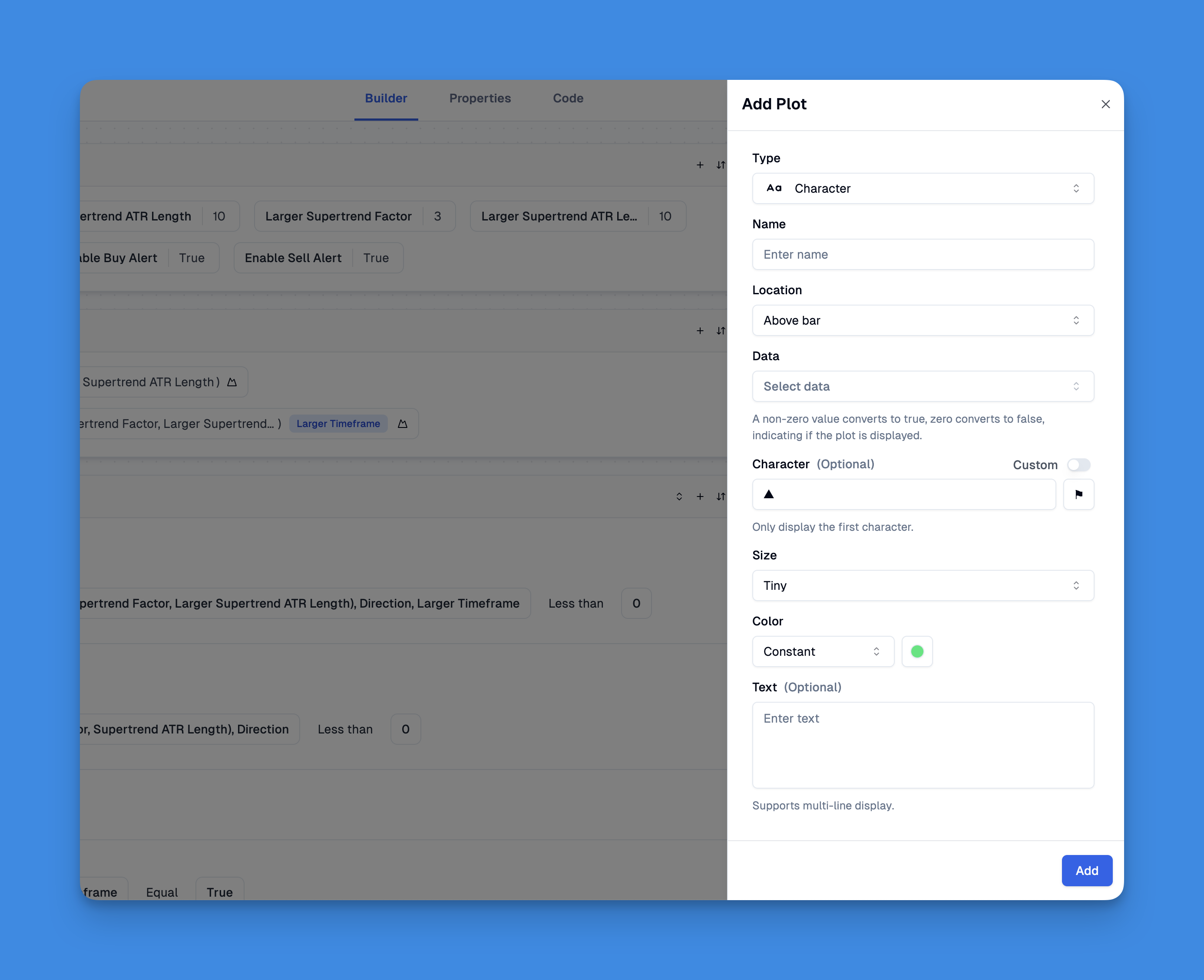
Text plotting in Pine Script provides traders with powerful annotation capabilities that can transform chart analysis and strategy visualization. While traditionally requiring coding expertise, modern tools have revolutionized how traders implement these features on TradingView charts. Pineify stands out as a solution that enables users to plot text elements without any programming knowledge, making sophisticated chart annotations accessible to all traders.
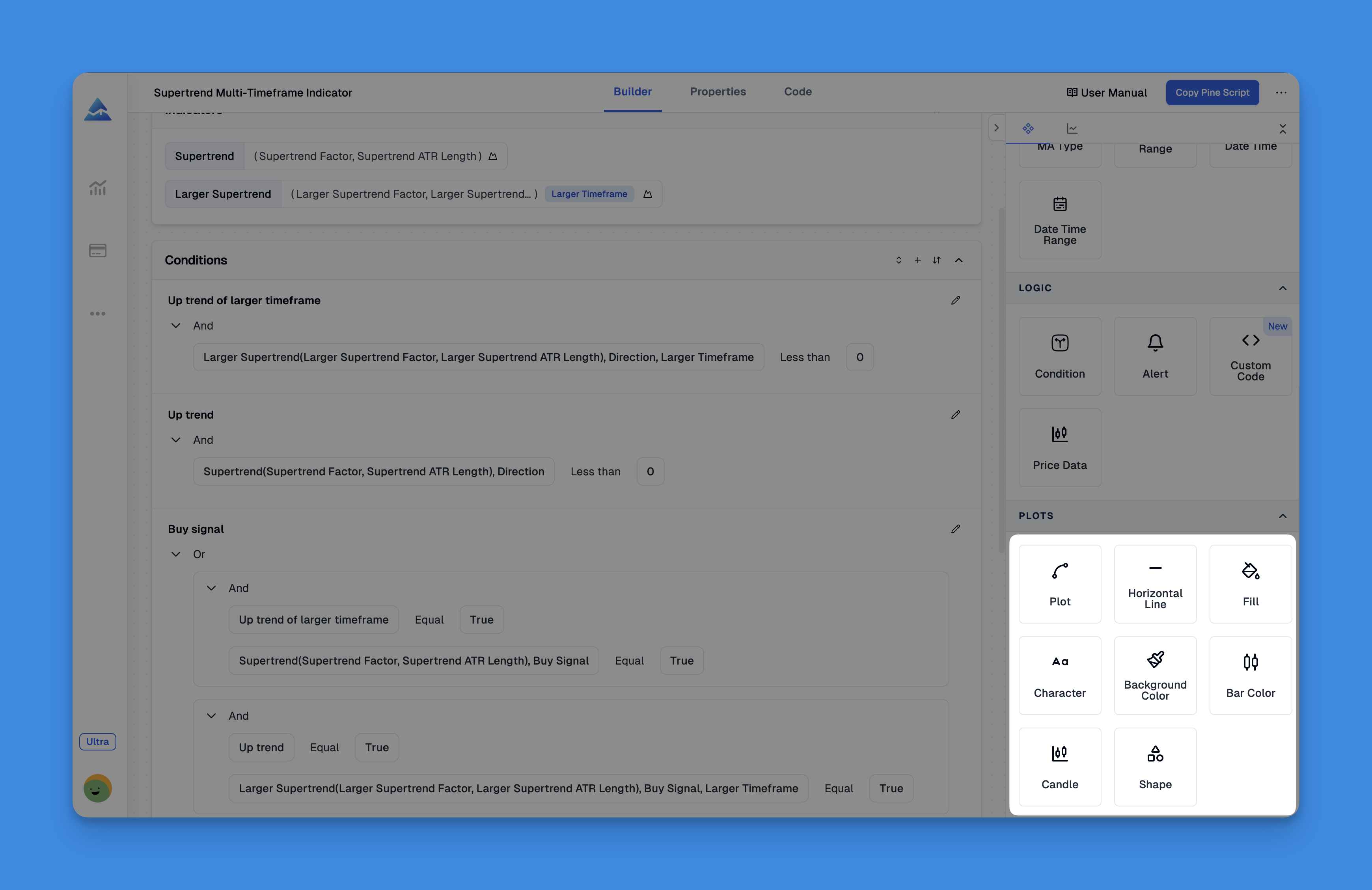
With Pineify's visual editor, you can plot various text elements including characters, shapes, and custom annotations directly on your charts. This functionality extends beyond simple text to include comprehensive visualization options like background colors, histograms, lines, and candlestick overlays—all customizable through an intuitive interface rather than complex code1. The platform supports up to 13 different input types, allowing you to modify text parameters directly on your charts at any time.
Website: Pineify
Click here to view all the features of Pineify.plotshape() Function
The plotshape() function is more versatile for displaying text with shapes:
//@version=5
indicator("Shape with Text")
plotshape(true, title="Signal", text="BUY", style=shape.labelup, location=location.belowbar, color=color.green, textcolor=color.white)
With plotshape() you can:
- Display predefined shapes alongside text
- Show text without the shape by setting
colortona - Control text appearance with the
textcolorparameter - Display text above or below bars using the
locationparameter
Stacking Text with plotshape()
To display multiple lines of text on the same bar, you can use the newline character \n followed by a special Unicode character:
//@version=5
indicator("Stacked Text")
plotshape(true, text="Line 1\nLine 2", style=shape.labelup, location=location.belowbar, color=na, textcolor=color.white)
The Unicode zero-width space (U+200E) helps preserve the newline functionality. This character needs to be the last one in the string for text going up, and the first one for text going down.
Labels vs. Plot Functions
While plotchar() and plotshape() are useful, they have limitations:
- They cannot display dynamic “series” values (like changing prices)
- They appear on every bar where the condition is true
- They have limited formatting options
For more advanced text display, consider using labels with label.new(), which:
- Can display dynamic text with series values
- Support up to 500 labels on the chart
- Allow for more customization options
- Can be positioned more flexibly
Best Practices for Text Plotting
To ensure your text displays effectively:
- Choose the right function based on your needs:
- Use plotchar() or plotshape() for simple, static text
- Use labels for dynamic, customizable text
- Optimize visibility:
- Control text position using the
locationparameter - Set appropriate colors with
textcolor - Use size parameters to ensure readability
- Control text position using the
- Avoid clutter:
- Only display text when necessary
- Use conditional logic to show text only on significant bars
- Consider using tables for information that shouldn’t move with chart scrolling
- Format text properly:
- Use clear, concise messages
- For stacked text, properly implement newlines with Unicode characters
- Consider using Unicode symbols for visual indicators
Practical Examples
Simple Price Label
//@version=5
indicator("Price Label")
isHighPrice = high == highest(high, 10)
plotshape(isHighPrice, text="High", style=shape.labeldown, location=location.abovebar, color=na, textcolor=color.green)
Stacked Information Display
//@version=5
indicator("Stacked Info")
rsi = rsi(close, 14)
rsiText = "RSI: " + str.tostring(rsi, "#.##")
macdText = "MACD: " + str.tostring(macd(close, 12, 26, 9)[^0], "#.##")
plotshape(true, text=rsiText + "\n" + macdText, style=shape.square, location=location.bottom, color=na, textcolor=color.white)
Conclusion
Mastering text plotting in Pine Script allows you to create more informative and visually appealing indicators. By choosing the appropriate method and following best practices, you can effectively communicate important information directly on your charts, enhancing your trading analysis and decision-making process.