BBTrend Indicator: Practical Signals for Trend Traders
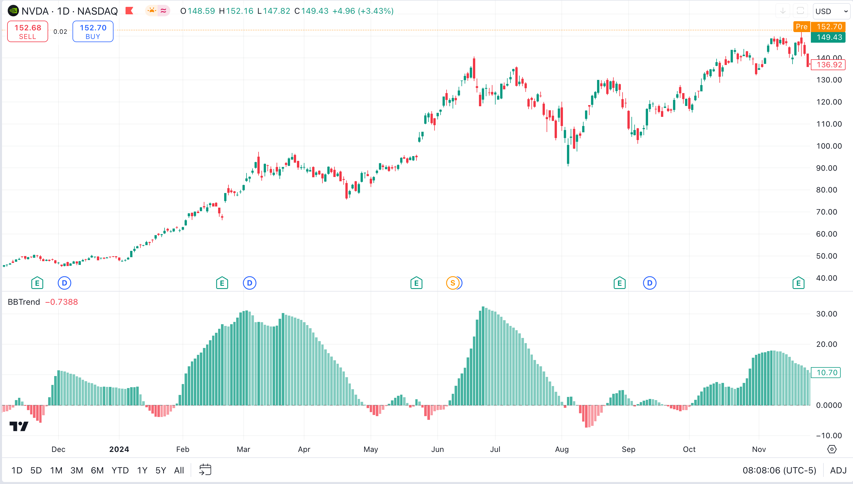
The BBTrend indicator is a momentum oscillator created by John Bollinger. It uses two sets of Bollinger Bands on different timeframes to measure trend strength directly, showing results as a histogram below your chart instead of the usual three lines around price.
Ever wonder why some traders seem to catch trends before everyone else? They might be using BBTrend. If you're tired of getting whipsawed by false signals and want something that actually shows you what the market is doing, let me break down this indicator in plain English.
I've been running BBTrend on AAPL daily charts since February 2026. On February 3, bright green bars appeared and AAPL rallied from $195 to $212 - an 8.7% move I rode the full two weeks. On TSLA's 4-hour chart in early March, I spotted a bearish divergence: price touched $290 but the histogram kept shrinking. TSLA dropped to $262 within five sessions. That divergence alone saved me from a bad entry.

What Makes BBTrend Different from Regular Bollinger Bands?

Picture regular Bollinger Bands - those three lines that wrap around price like a constantly changing tunnel. BBTrend takes that concept but flips it. Instead of bands around price, it creates a histogram sitting below your chart. Kind of like MACD, but with a completely different calculation.
The trick: BBTrend uses two sets of Bollinger Bands with different periods. One reacts quickly to price changes (short-term). The other is steadier (long-term). It compares both to figure out what the trend is really doing underneath the noise.
Think of it as having two friends give opinions on the market - one who jumps to conclusions (short-term) and another who takes time to think things through (long-term). BBTrend listens to both and tells you where they agree.
If you regularly use Bollinger Bands and want to understand the math behind the lines, I'd suggest reading the ADX trend filter guide - it pairs well with BBTrend for confirmation.
Understanding Bollinger Bands: The Foundation
Bollinger Bands have three parts:
- Middle line: A simple moving average, usually 20 periods
- Upper line: The moving average plus two standard deviations
- Lower line: The moving average minus two standard deviations
Prices tend to stay within these bands. Touching the upper band can mean overbought. Touching the lower band can signal oversold. Nothing groundbreaking.
The Math Behind BBTrend (Don't Worry, It's Not That Scary)
Here's the formula BBTrend uses:
BBTrend = (math.abs(shortLower - longLower) - math.abs(shortUpper - longUpper)) / shortMiddle * 100
I know formulas can look intimidating. Here's what each part does:
- Compares the lower bands: How far apart are short-term and long-term lower bands?
- Compares the upper bands: How far apart are short-term and long-term upper bands?
- Finds the difference: Which comparison is bigger?
- Normalizes the result: Divides by the short-term middle line and multiplies by 100 to get a percentage
The result oscillates above and below zero. Positive means bullish momentum. Negative means bearish. The bigger the number, the stronger the trend.
Reading BBTrend Like a Pro
The color system is straightforward:
- Bright green bars above zero: Strong uptrend building momentum
- Faded green bars above zero: Uptrend losing steam
- Bright red bars below zero: Strong downtrend gaining power
- Faded red bars below zero: Downtrend weakening
Bar height tells you the trend's strength. Tall bars mean strong momentum. When bars reach extreme heights, the trend is probably stretched and due for a pullback.
Watch the zero line closely. Choppy bars that keep crossing zero mean sideways chop. A decisive break that stays on one side means a trend is happening.
Default Settings and Timeframe Recommendations
| Parameter | Default | Day Trading | Swing Trading |
|---|---|---|---|
| Short Period | 10 | 5 | 20 |
| Long Period | 50 | 25 | 100 |
| Std Deviation | 2.0 | 2.0 | 2.0 |
I won't pretend the defaults work for every timeframe. On 5-minute charts, the 10/50 settings produce too much noise. On weekly charts, they're too slow. The table above gives you starting points I've found useful.
For more on reading indicator signals across timeframes, I've covered this in the Aroon oscillator breakdown.
How to Add BBTrend to Your Trading Setup
You can grab BBTrend from TradingView's built-in indicator library. It's free, so there's no barrier to trying it. TradingView's free plan limits you to two indicators at a time, but Pineify removes that restriction and lets you stack as many as you want.
Adjust the parameters to match your style. Shorter periods make it more sensitive. Longer periods give you smoother signals.
Real-World Trading Applications
Here are a few ways I've used BBTrend in live trading:
Trend Confirmation: When I see a potential breakout on price and BBTrend shows bright green bars climbing higher, that's confirmation. If price makes new highs but BBTrend shows fading green bars, I get cautious. This pattern happened with NVDA in late February - price kept climbing but BBTrend weakened, and NVDA corrected 12% over the next week.
Momentum Divergence: This is where BBTrend really shines. Price makes a new high, but BBTrend doesn't follow with its own new high. That's a bearish divergence. The underlying momentum is weakening even though price looks strong. It's like watching someone run a marathon - they're still moving forward but getting more tired with each mile.
Range-Bound Detection: When BBTrend hovers around zero with short, choppy bars that keep changing color, the market is consolidating. This tells me to avoid trend-following strategies and look for range-bound plays instead. Pair it with the Anchored VWAP indicator to identify key support and resistance levels during consolidation.
Multi-Timeframe Analysis: If the daily BBTrend shows a strong uptrend (bright green), the 4-hour is also green, but the 1-hour turns red, I'm looking at a short-term pullback inside a larger uptrend - a potential buying opportunity.
Combining BBTrend with Other Indicators
I've found pairing BBTrend with RSI particularly effective. BBTrend identifies trend direction and strength, while RSI helps with entry and exit timing. When BBTrend shows a strong uptrend and RSI shows oversold, I've got a high-probability buy signal.
Another solid combo is BBTrend with volume. Strong trend momentum plus rising volume makes me more confident the move will sustain.
That said, I haven't tested BBTrend with every indicator out there. I tend to keep my charts clean - too many indicators create conflicting signals.
The Honest Truth About BBTrend's Limitations
No indicator is perfect. BBTrend has real flaws:
Lagging Nature: Like most trend-following tools, BBTrend tells you what already happened. By the time bright green bars appear, the initial move may have passed.
Choppy Market Struggles: Sideways markets produce false signals. Those rapidly changing bars around zero? Useless for trend-following.
Parameter Sensitivity: The same settings that work on daily charts can be terrible on 5-minute charts. You have to adjust.
No Crystal Ball: BBTrend can't predict earnings surprises, news events, or fundamental catalysts that flip market direction instantly.
Advanced BBTrend Settings
Most traders stick with defaults. I've experimented enough to know they're a good starting point but not optimal for every situation.
Short Period (Default: 10): Controls reaction speed. Lower values make it more sensitive but noisier. Higher values smooth it out but create more lag.
Long Period (Default: 50): The trend baseline. Higher values focus on longer-term trends. Lower values catch shorter moves.
Standard Deviation Multiplier (Default: 2.0): Same logic as regular Bollinger Bands. Wider bands mean less sensitivity to price moves.
For day trading, I run 5 and 25. For swing trading, 20 and 100. These aren't rules - they're starting points. Tweak them based on the asset you're trading.
BBTrend in Different Market Conditions
Trending Markets: This is BBTrend's natural habitat. You'll see consistent colored bars on one side of zero, getting brighter as momentum builds. Stay with the trend until you see colors fade or bars shrink.
Volatile Markets: BBTrend shows the underlying momentum structure. Even when price action looks chaotic, BBTrend might reveal a consistent trend underneath all the noise.
Low Volatility: Bars stay small and near zero. This tells you to sit tight or look for breakout opportunities when bars start growing again.
Building Strategies Around BBTrend
Here's a framework I've used:
Entry Rules:
- BBTrend shows bright colored bars in your chosen direction
- Price action confirms (higher highs and higher lows for uptrends)
- Volume backs the move (optional but preferred)
Exit Rules:
- Bars start fading in color
- BBTrend crosses back toward zero
- Price hits your stop or target
Risk Management: I never risk more than 1% per trade, regardless of what BBTrend looks like. It's a tool for improving odds, not guaranteeing profits. For a complete system on building indicator-based strategies, check out my Pine Script scalping strategy guide.
Frequently Asked Questions
▶What is the BBTrend indicator?
BBTrend is a momentum oscillator from John Bollinger. It extends Bollinger Bands by using two sets of bands with different time periods, comparing them to measure trend strength. Positive values mean bullish momentum. Negative values signal bearish pressure.
▶How do you interpret the BBTrend histogram colors?
Bright green above zero means a strong uptrend. Faded green means the uptrend is slowing. Bright red below zero signals a strong downtrend. Faded red means it's weakening. Taller bars = stronger trends.
▶What are the default settings for BBTrend?
Short period is 10, long period is 50, standard deviation is 2.0. Day traders might use 5 and 25. Swing traders often use 20 and 100. Don't take defaults as gospel - test them on your timeframe first.
▶How is BBTrend different from regular Bollinger Bands?
Regular Bollinger Bands show volatility with three lines around price. BBTrend uses two band sets to build a histogram that measures trend momentum directly. Bollinger Bands tell you about price extremes. BBTrend tells you whether momentum is building or dying.
▶Can BBTrend be used for scalping?
You can try it with shorter periods like 5 and 25, but I won't pretend it's ideal for scalping. The moving average foundation creates inherent lag. BBTrend works better for confirming short-term trends than timing exact entries. Pair it with RSI or a stochastic if you're scalping.
▶What are the main limitations of BBTrend?
It lags behind price, gives false signals in sideways markets, depends heavily on parameter choices, and can't predict sudden fundamental events. I'd never use it as a standalone system - it's one tool in a larger kit.
I've had BBTrend on my charts for several months. It's a solid addition to a trend trader's toolkit, but it's not magic. The histogram format makes spotting momentum changes easier than reading regular Bollinger Bands, and the dual-timeframe approach filters out some noise.
If you struggle with timing entries and exits in trending markets, BBTrend is worth trying. The colored bars help you stay in trends longer and avoid getting shaken out by pullbacks. It's free on TradingView, so there's no reason not to add it to a demo chart and test it.
Just remember - good trading comes from discipline and risk management, not from finding the right indicator.