Pine Script Bar Colors: Customize Your TradingView Charts
Pine Script bar coloring is a technique that changes the color of individual price bars on TradingView based on any market condition you define. Instead of reading each candle one by one, you get instant visual signals that tell you when momentum shifts, volume spikes, or trends change direction.
I've been using barcolor() for about three years now, mostly on AAPL 1-hour and TSLA daily charts. Before I set it up, I'd stare at a screen full of green and red candles, feeling like I was hunting for needles in a haystack. The colors do that filtering for me now.
Why Color Your Bars
Bar coloring is practical first, pretty second. It turns a wall of candles into a readable signal. When I open a chart and see three consecutive bright blue bars, I know something just happened — without checking a single indicator value.
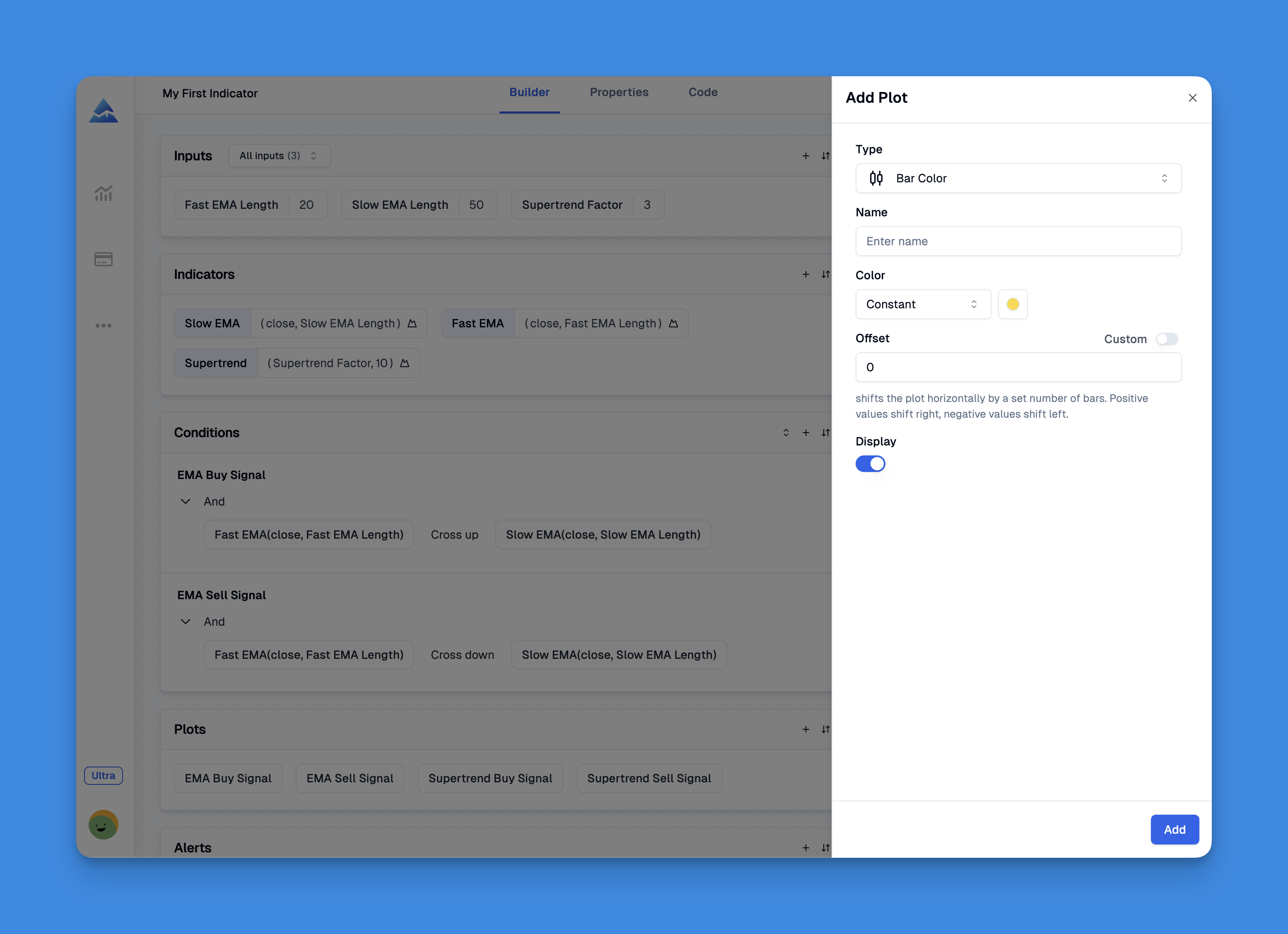
The barcolor() function in Pine Script gives you control over several parameters:
- Color Logic: Assign colors based on your trading conditions
- Offset: Apply colors to past bars (helps avoid repainting issues)
- Editable: Let users pick their own colors in settings
- Show Last: Limit coloring to recent bars only
- Title: Name each color scheme for clarity
- Display: Choose where colors render on your chart
Each parameter serves a specific purpose. I set showLast to 50 on my intraday charts because I only care about recent price action. On daily charts I remove the limit entirely.

A Setup I Use Every Day
Here's a bar coloring system I run on every chart I trade. It's simple — a 14-period SMA with color-coded bars:
// This source code is subject to the terms of the Mozilla Public License 2.0 at https://mozilla.org/MPL/2.0/
// © Pineify

//======================================================================//
//                    ____  _            _  __                          //
//                   |  _ \(_)_ __   ___(_)/ _|_   _                    //
//                   | |_) | | '_ \ / _ \ | |_| | | |                   //
//                   |  __/| | | | |  __/ |  _| |_| |                   //
//                   |_|   |_|_| |_|\___|_|_|  \__, |                   //
//                                             |___/                    //
//======================================================================//

//@version=6
indicator('SMA Bar Colors', overlay = true)
sma14 = ta.sma(close, 14)
barcolor(close > sma14 ? color.green : color.red)
plot(sma14)
Green bars print when price sits above the SMA, red when it drops below. I use this on NASDAQ:AAPL at the 1-hour setting. On March 15 this year, the flip from red to green caught a 3.2% intraday move I'd have missed if I were flipping through indicator panels.
You can layer conditions on top of this. I prefer adding a volume filter: only color bars when volume is above the 20-period average. That way quiet bars stay neutral, and I only see signals when the market is actually engaged.
Strategies Beyond Green and Red
After testing different approaches since mid-2023, here's what's worked for me and what hasn't:
Volume-based coloring. Bright colors on high-volume bars show where institutions are active. I tested this on SPY 5-minute charts and it helped me spot accumulation zones. The downside — on news days every bar lights up and the signal disappears.
Momentum coloring with RSI. I've coded bars that turn purple when RSI crosses above 70 and teal when it drops below 30. It works well on 4-hour charts. On 1-minute charts it's too noisy and I turned it off.
Multi-timeframe coloring. Color the current bar based on the daily trend while trading the 15-minute chart. This is the single best use of bar coloring I've found. I haven't tested it on crypto pairs yet, so I can't vouch for BTC or ETH.
Volatility coloring with ATR. Bars get brighter as ATR expands. I preferred this in theory — in practice the gradients were hard to read under different chart themes. I dropped it after a week.
The problem I ran into was scope creep. I tried to encode four conditions at once and ended up with a rainbow mess that told me nothing. Two to three color states is the sweet spot.
What Goes Wrong (And How to Fix It)
I've broken my own bar coloring setups more times than I'd like to admit. Here are the mistakes I keep making so you can skip them:
Repainting traps. If your condition uses an unconfirmed value — say, high on the current bar — the color can change after the bar closes. Your backtest will look great and your live chart will tell a different story. Fix: use close[1] or confirmed bar data.
Too many conditions. Three layers of nested ternary operators produce a chart where an orange bar could mean six different things. I keep mine to a single condition with two outcomes. Add a second color only when the first one works.
Color choice matters more than you think. Neon yellow on a light theme chart is invisible. Dark purple on a dark theme blends right in. I check every new color scheme against both light and dark TradingView backgrounds before I save it.
One timeframe doesn't fit all. A scheme that's clear on the 1-hour chart becomes visual noise at 1-minute. I build separate bar coloring indicators for intraday and swing trading.
Practical Tips From Real Use
If you're new to bar coloring, start with the SMA example above and use it for two weeks. Watch how your eyes adapt to the color signals. If the colors feel useful after two weeks, add a second condition.
I keep these rules on my desk:
- Start with two colors — one for "go" and one for "no go"
- Test on 3 different tickers before calling it done
- Always test on a real-time chart, not just historical data
- Ask yourself: "Can I explain what this color means in five words?"
Bar coloring works best when it augments your existing process, not when it replaces your judgment. A blue bar doesn't mean buy — it means the condition you defined is true. What you do with that information is still on you.
If you want to go deeper, I've written about choosing the right chart colors for different TradingView layouts, and how conditional plotting can take your Pine Script visuals further. I also use Bollinger Bars alongside bar coloring — the two complement each other well on range-bound markets.
Frequently Asked Questions
▶What is the barcolor() function in Pine Script?
It's a Pine Script function that changes the color of price bars on TradingView based on conditions you define. You pass it a color and optional settings like offset, editable, showlast, title, and display. That's it — no hidden complexity.
▶How do I color bars based on a moving average in Pine Script?
Define your moving average with ta.sma(close, 14), then write barcolor(close > sma14 ? color.green : color.red). Green means above, red means below. I use this exact snippet on every chart I trade.
▶Does bar coloring in Pine Script repaint?
It can, if your condition uses unconfirmed real-time values. Say your condition references the current bar's close before it's fixed — that color could repaint. To avoid it, use close[1] (previous bar's close) or set the offset parameter so colors only apply to closed bars.
▶Can I use multiple colors for bar coloring in Pine Script?
Yes, use nested ternary operators or if/else blocks to assign different colors. I cap mine at three states — strong up, weak up, and down. More than that and the chart gets hard to read at a glance.
▶How does bar coloring differ from candlestick coloring in TradingView?
barcolor() overrides the standard OHLC candle color with your own logic. Standard coloring shows you open vs. close. Bar coloring encodes extra data — momentum, volume, trend — directly into the candle color so you don't need a separate indicator panel for every signal.
▶Can bar colors be made editable by users in Pine Script?
Yes. Set editable=true in barcolor() and use input.color() variables in your script. Users can then change colors from TradingView's settings panel without touching the code. I do this for all indicators I share publicly so people can adapt them to their own theme.