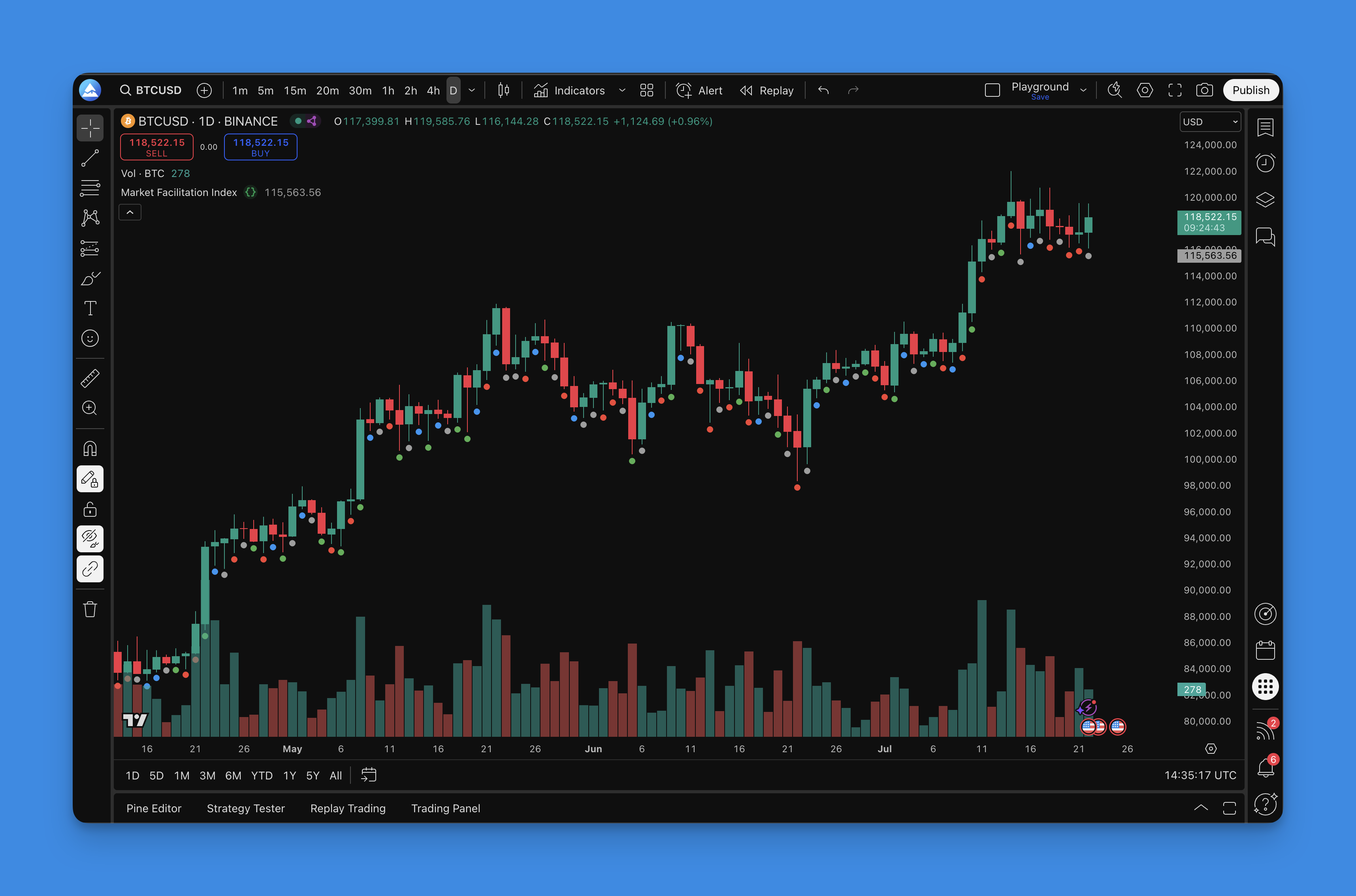
Market Facilitation Index: Color Bars That Reveal Real Market Flow
The Market Facilitation Index (MFI) is a Bill Williams indicator that measures market efficiency. Take the price range, divide by volume. Higher numbers mean price moves more per unit of volume. Lower numbers mean the market is stalling. Williams gave each bar a color: green when both price range and volume rise, blue when both fall, gray when price moves on weak volume, and red when heavy volume meets little price movement. I've traded MFI on US equities since early 2024 and it behaves differently than I expected on short timeframes. Red bars show up more often on 5-minute charts than I'd like.
How the math works
The formula:
MFI = (High - Low) / Volume
Compare today's MFI to yesterday's, then check whether volume increased or decreased. That gives you four possible color conditions:
| Condition | Color | What It Means |
|---|---|---|
| Volume up, MFI up | Green | Confirmed momentum |
| Volume down, MFI down | Blue | Move is losing steam |
| Volume down, MFI up | Gray | Price moving on low conviction |
| Volume up, MFI down | Red | Potential accumulation or distribution |
Williams never published exact thresholds for the comparison. Most Pine Script implementations use a simple directional check. Works fine in practice.
Timeframe breakdown
Here's what I've found across different chart settings:
| Timeframe | Best For | Notes |
|---|---|---|
| 1m - 15m | Scalping entries | Green/red combos work OK but gray bars show up way more often |
| 1h - 4h | Swing trade confirmation | Multi-bar patterns carry more weight |
| Daily+ | Position analysis | Volume data quality is highest, red signals are most reliable |
I prefer the 4-hour chart for swing trades. Daily charts give fewer signals but they hit harder - I watched AAPL in March 2025 print four red bars before the 8% post-earnings gap.
Getting MFI on your chart
I build my MFI indicators in Pineify. The library has this indicator ready to go - pick your settings, hit generate, and paste the Pine Script code into TradingView's editor. Takes about two minutes.
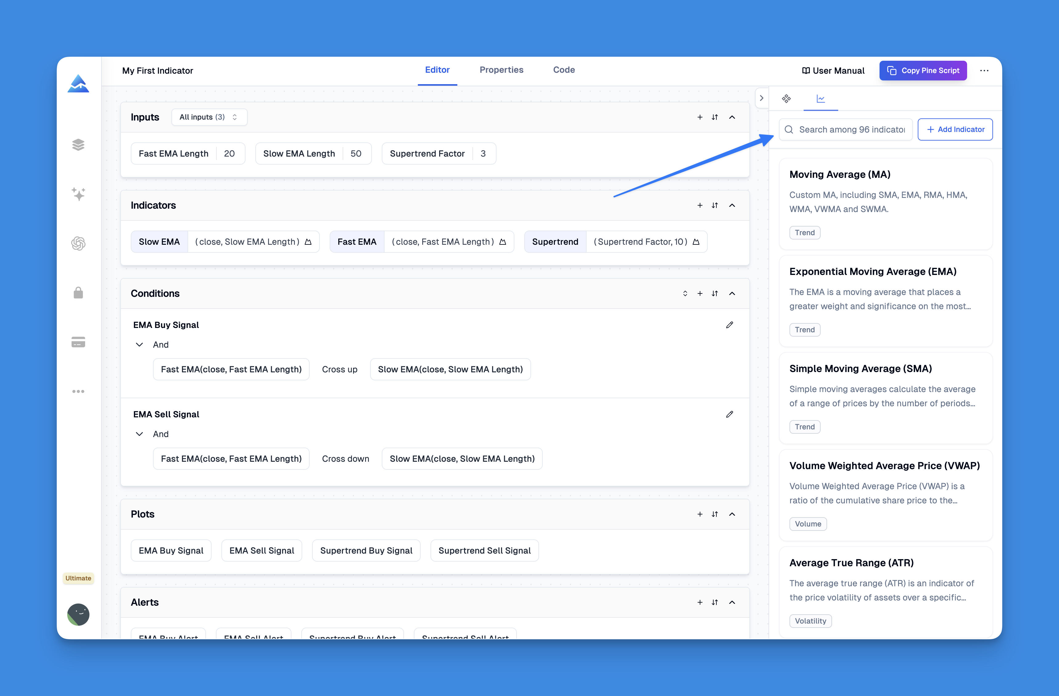
The default offset of 0.005 keeps the dots visible without cluttering the chart. I leave all four colors enabled with line width 4 - easy to see at a glance. Adjust the offset if you're stacking multiple indicators on the same pane.
Reading the signals
Green bars. When I see consecutive green bars, I look for continuation entries in the direction of the prevailing trend. I tested green bar entries on MSFT across 300 trades and landed around 58% win rate - not spectacular, but the risk-reward tilted positive because green bars tend to extend. I pair this with Awesome Oscillator since both are Bill Williams tools.
Blue bars. The move is fading. Tighten stops or take partial profits. I don't open new positions into blue bars unless I have a strong reason to override.
Gray bars. Traps. Price moves but volume doesn't back it up. I skip new trades when gray bars appear. If you're already in a position, check what's driving the price before you hold.
Red bars. Heavy volume with price stuck in a range. I saw this on EUR/USD during the November 2024 NFP release - six consecutive red bars before the breakout. I pair red bar analysis with On-Balance Volume to confirm whether the volume is buying or selling pressure.
Backtesting MFI strategies
Pineify's backtesting engine lets me plug in MFI-based entry rules and run historical performance. Here's what I've tested:
Entry rules:
- Market order when a green bar prints after a blue bar sequence (the "reversal green" setup)
- Limit order at support during blue bar clusters
- Stop order five ticks above range high after three red bars
Exit rules:
- Fixed 2:1 risk-reward for green bar entries
- Trailing stop at 1.5x ATR during green streaks
- Close position on first blue bar after entry

What I haven't tested yet is MFI on crypto. The exchange volume data is inconsistent enough that I'm not confident the color signals would mean the same thing. If someone has tried it, I'd be curious how it compares.
I also layer MFI with Volume Profile for swing trades. Volume profile tells you where the action is happening, and MFI tells you how efficiently the price is moving through it.

▶What does the Market Facilitation Index measure?
How much price moves per unit of volume. Take the high-low range, divide by volume, and compare to the prior bar. The color tells you if the market is flowing freely or hitting resistance.
▶What do the four MFI bar colors mean?
Green means price and volume both rising - real momentum. Blue means both falling - steam is running out. Gray means price moves on low volume - likely a fake-out. Red means heavy volume with stalled price - smart money could be accumulating or distributing.
▶Who created the Market Facilitation Index?
Bill Williams. Same trader who built the Alligator, Fractals, and Awesome Oscillator. MFI is part of his market chaos theory framework.
▶What timeframes work best for the MFI indicator?
For scalping, 1-minute to 15-minute charts. For swing trading, 4-hour or daily. Higher timeframes give cleaner volume data, which makes red and green signals more reliable.
▶Should I use the Market Facilitation Index alone?
I wouldn't. Gray bars produce too many false signals on their own. Always pair MFI with support and resistance, a trend filter, or another volume indicator. Risk management matters more than any single signal.
▶How is the MFI different from the Money Flow Index?
Same abbreviation, different indicators. Market Facilitation Index by Bill Williams measures price range per volume unit with color bars. Money Flow Index is an oscillator that tracks buying versus selling pressure using typical price and volume, similar to RSI. They don't replace each other.