TradingView Backtest Alternative: Smarter Analysis with Pineify
If you've ever downloaded your TradingView strategy results as a CSV and felt lost in a sea of numbers, I get it. Pineify Backtest Deep Report is a browser-based tool that turns that raw trade list into a full performance dashboard. You upload the CSV, and in seconds you get 16+ KPIs, Monte Carlo simulations, MFE/MAE analysis, rolling window stats, and time-based heatmaps — all processed on your own machine so your data never leaves your device. TradingView's built-in backtester is great for quick checks, but when you need real depth, it comes up short.
I've run into this myself testing a EUR/USD trend-following strategy earlier this year. The standard TradingView report showed a 62% win rate and a nice equity curve, but I had no way to tell if those returns would hold up if the market behaved differently. That's the gap Pineify fills.
Hitting the Ceiling with TradingView's Built-In Backtest
Don't get me wrong — TradingView's Strategy Tester works fine when you're getting started. But once you move past the basics, you'll feel its limits. It shows surface-level stats like net profit and win rate, but doesn't help you answer harder questions about your strategy's real reliability. For those building more sophisticated logic, our guide on Pine Script Multiple Conditions covers how to craft more precise entry and exit rules.
Here are the specific walls you'll hit:
- Missing key metrics: It doesn't calculate risk-adjusted ratios (Sharpe or Sortino) that professionals use to compare strategies fairly.
- No stress-testing: There's no Monte Carlo simulation. You can't see how your strategy might perform across thousands of different random market scenarios.
- Can't track performance over time: Without rolling window analysis, you can't tell if your strategy's edge is fading or stable as market conditions shift.
- Deep data costs more: You often need a paid plan for extended historical data to properly backtest over long periods.
- No trade efficiency insight: Missing MFE/MAE analysis makes it hard to optimize exit points like profit targets and stops.
- Reports aren't professional grade: The export is a basic trade list CSV. You can't generate a presentation-ready report to review or share.
For tinkering or simple ideas, this is fine. But if you're systematically developing strategies, quantifying your edge, or managing real capital, these gaps become a real blocker.
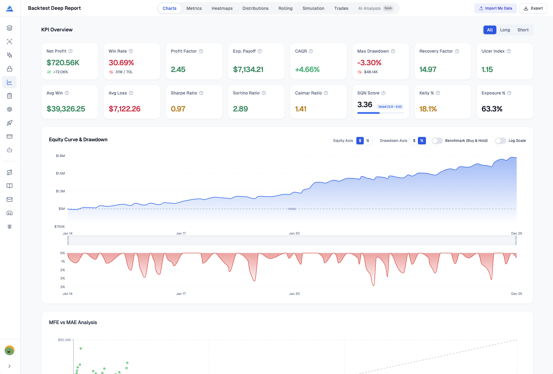
16+ Institutional-Grade KPIs to Understand Your True Performance
TradingView gives you a few basic numbers. Pineify surfaces the full analytical toolkit so you can diagnose your strategy like a pro. Every metric breaks down by longs versus shorts — directional insight TradingView doesn't offer. I've found this split alone can change how you view a strategy's actual strengths and weaknesses.
| Metric | TradingView | Pineify Deep Report |
|---|---|---|
| Net Profit | ✅ | ✅ |
| Win Rate | ✅ | ✅ |
| Max Drawdown | ✅ | ✅ |
| Sharpe Ratio | ❌ | ✅ |
| Sortino Ratio | ❌ | ✅ |
| Calmar Ratio | ❌ | ✅ |
| SQN Score | ❌ | ✅ |
| VaR (95%) / CVaR | ❌ | ✅ |
| Ulcer Performance Index | ❌ | ✅ |
| Kelly Criterion | ❌ | ✅ |
| Skewness / Kurtosis | ❌ | ✅ |
| Recovery Factor | ❌ | ✅ |
What do these extra metrics actually tell you?
Think of the Sharpe Ratio as your risk-adjusted return score: "Am I being compensated enough for the volatility I'm sitting through?" The Sortino Ratio goes further by only punishing the bad volatility, which I've found gives a clearer picture for most strategies I test.
The SQN (System Quality Number) judges the overall soundness of your trading system. The Ulcer Performance Index measures not just how big your drawdowns are, but how painful and prolonged they feel. I've had strategies where the max drawdown looked acceptable but the ulcer index told a different story — and that was the real signal I needed.
Rolling Window Analysis: See How Your Strategy Holds Up Over Time
Pineify added Rolling Window Analysis in version 2.0. It constantly checks the performance of your last 20 trades, giving you a moving picture of how your strategy is doing right now. This kind of focused feedback isn't something TradingView offers.
Instead of looking at lifetime P&L, you're checking recent health. This lets you:
- See if your risk-adjusted returns are steady. Are the good returns coming with predictable risk, or is the strategy becoming more erratic?
- Spot quiet periods where wins dry up. Your overall win rate might look fine, but this can reveal a hidden string of losses.
- Catch a strategy that's starting to fade before a rough patch turns into a major problem for your live account.
Traders using Pineify have told me this feature helped them notice a strategy was losing its edge a full two months before they would have seen it in end-of-month reports. I haven't run this on a 10,000+ trade log myself — browser-side performance could slow with very large datasets. But for the typical 200-500 trade backtest, it's instant.
You can see it in action here: youtube
Monte Carlo Simulation: Seeing Beyond a Single Backtest
You finish a backtest and the results look great. But a quiet voice asks: "What if things had happened in a slightly different order?" Markets don't repeat themselves. To build a strategy that works across different conditions, understanding TradingView algorithms is a good starting point.
The standard TradingView backtester shows one path — the one that actually happened. But what about all the other possible paths?
Pineify runs 1,000 bootstrap simulations on your trade history. It takes all your past trades, shuffles them into random sequences, and creates a thousand plausible versions of your trading history.
This gives you three insights you can't get elsewhere:
- Worst-Case Drawdown at 95% and 99% Confidence: Instead of your maximum historical loss, you see how bad losses could get in most tough markets and in extreme conditions.
- Your Real Risk of Ruin Probability: The statistical chance that a string of losses could wipe out your account. Essential for deciding position sizing.
- A Visual Spaghetti Chart: Hundreds of possible equity curves overlaid. Some go up and to the right, some dip and recover, a few tumble. You can visually feel the uncertainty.
You're stress-testing your strategy against a thousand different versions of the past. Professional trading desks do this routinely. Pineify makes it part of your TradingView workflow.
Are Your Exit Points Costing You Money? MFE and MAE
Ever closed a winning trade and watched the price keep soaring? Or been stopped out only to see the price reverse and go where you expected? It's frustrating, and it usually comes down to how you set profit targets and stops.
Maximum Favorable Excursion (MFE) measures how far a trade moved in your favor before you closed it. Maximum Adverse Excursion (MAE) measures how far it went against you. Sometimes the issue comes from using an indicator that isn't designed for strategic exits. Learning how to convert an indicator to a strategy in TradingView can help formalize these signals.
Pineify creates a scatter plot that shows all your trades at a glance:
- Each dot is one trade, with MAE on the X-axis and MFE on the Y-axis.
- Green dots are wins, red dots are losses.
- A reference line shows where MFE equals MAE.
This plot gives instant answers. Are winning trades clustering with high MFE but low MAE? Your profit targets might be too conservative. Are losing trades showing huge MAE? Your stop losses might be too tight, getting you knocked out by normal market noise.
Traders who use this often discover they were leaving about 30% of potential profits unclaimed. By adjusting exits based on the data, many have increased their average winning trade by 15% or more.
Spotting Patterns with Visual Heatmaps
Looking at overall P&L isn't always enough. Pineify's heatmaps uncover hidden rhythms — the specific times when your strategy shines or struggles.
- Monthly Returns Matrix: Performance for every month across every year. You can spot if your strategy habitually pulls back in September or rallies in April.
- Weekly Returns (Weeks 1-53): Seasonal trends throughout the calendar year. Certain weeks that are reliably strong or weak.
- Daily / Time Efficiency Heatmap: Performance by hour of day and day of week. Do your trades work best on Tuesday mornings? Does your strategy fade after lunch on Fridays?
This answers a practical question: should you run this strategy all the time, or only during its best windows? It's hard to piece this together from a standard backtest report.
Export Everything to One Organized Excel File
When you need to share analysis with a team or keep detailed records, Pineify exports everything with one click. It builds an Excel file with more than 8 separate sheets:
| Sheet Name | What You'll Find There |
|---|---|
| KPI Overview | Key performance metrics in one summary. |
| List of Trades | Complete, timestamped trade log. |
| Monthly Returns | Performance by month. |
| Weekly Returns | Performance by week. |
| Daily Returns | Performance by day. |
| Rolling Statistics | Rolling volatility and Sharpe ratio. |
| Distribution Data | Statistical spread of returns. |
| Monte Carlo Data | Simulation results for forecasting. |
I haven't used the export with a team yet, but for personal record-keeping it saves hours of manual spreadsheet work.
Get Started in 3 Steps
Nothing to install, no complicated setup. Your data stays on your machine.
- Export Your Trades from TradingView — Go to the Strategy Tester for your Pine Script, find "List of Trades," and export as a standard CSV file.
- Upload to Pineify — Go to pineify.app/backtest-report, drag and drop your CSV. Adjust settings like starting capital if needed, then hit go.
- Dig Into Your Analysis — You get 16+ KPIs, 8 analysis views, Monte Carlo simulations, and the option to export everything to a clean Excel file.
Everything processes directly in your browser. Your trade data never gets sent to our servers. For anyone working with real strategies, that privacy matters.
Pineify isn't just a backtest analyzer. The Visual Editor lets you build indicators without coding, the AI Coding Agent generates error-free Pine Script, and the daily AI stock picks give you ideas to test. Explore all the tools at pineify.app.
▶What is a backtest deep report and why do I need one?
A backtest deep report goes beyond win rate and net profit. It calculates institutional metrics like Sharpe Ratio, Sortino Ratio, SQN Score, and Monte Carlo simulations to show whether your strategy is genuinely good or just got lucky in one historical sequence.
▶How does Pineify Deep Report differ from TradingView's built-in backtester?
TradingView's Strategy Tester gives you surface stats. Pineify Deep Report adds 16+ KPIs, rolling window analysis over your last 20 trades, 1,000 Monte Carlo simulations, MFE/MAE scatter plots, time-based heatmaps, and one-click Excel export — all processed locally in your browser.
▶What is MFE/MAE analysis and how can it improve my exits?
MFE measures how far a trade moved in your favor before you closed it. MAE measures how far it went against you. Analyzing them together reveals whether your profit targets are too conservative or your stops are too tight — often uncovering 15-30% more potential profit.
▶How does Monte Carlo simulation work for trading strategies?
Pineify runs 1,000 bootstrap simulations by reshuffling your historical trade sequence. This generates a range of possible equity curves, worst-case drawdowns at 95% and 99% confidence, plus your risk-of-ruin probability — stress-testing the strategy against conditions that differ from the single historical path.
▶Is my trading data safe when using Pineify Deep Report?
Yes. All analysis runs in your web browser. Your CSV trade data is never uploaded or stored on any server. Your strategy details and trade history stay on your device.
▶What does rolling window analysis reveal that a standard backtest hides?
Rolling window analysis tracks your last 20 trades continuously, showing whether returns are stable or fading. Traders have used this to detect a dying edge up to two months earlier than traditional monthly reviews.
▶Can I analyze long and short trades separately in the deep report?
Yes. Every metric — win rate, average profit, Sharpe Ratio, drawdown — can be filtered to show All Trades, Longs Only, or Shorts Only. This often reveals one side is profitable while the other drags down overall performance.