TradingView Backtest Analyzer & Report Generator
In March 2025 I ran a trend-following strategy on SPY through TradingView's Strategy Tester and got a 1.7 profit factor that looked fine in the summary but told me nothing about path dependency. A TradingView backtest analyzer is only as useful as it is faithful to your exported trade tape and transparent about assumptions; Pineify's report generator reads the Strategy Tester "List of Trades" CSV and computes risk-adjusted metrics, distributions, rolling stability, resampled equity paths, calendar heatmaps, and excursion-based execution diagnostics in the browser. I kept hitting the same wall: a CSV of trades and no quick way to tell the story about risk, stability, and tail behavior. I didn't want to rebuild a quant stack every time I changed a parameter. Pineify's Backtest Deep Report (v2.0 — Rolling Analysis, VaR, Kelly Criterion and more) is a browser-based analyzer that ingests that export and produces a structured, multi-tab report you can use for decisions, documentation, and sizing conversations.
At a glance, the workflow matches what practitioners expect from institutional tooling without the spreadsheet gymnastics: more than sixteen professional KPI metrics, eight analysis tabs, one thousand Monte Carlo bootstrap paths, and one hundred percent client-side processing so your trade list never leaves your machine.
If you're comparing strategies, validating a release, or explaining drawdowns to a risk-minded partner, you need more than win rate and profit factor. You need a coherent narrative backed by numbers that survive scrutiny: downside-aware ratios, tail measures, sequence stress tests, and time-varying behavior. That's the gap the Pineify Backtest Deep Report targets, and it's why I treat it as a reporting layer on top of TradingView rather than a replacement for the Strategy Tester itself.
Key Numbers at a Glance
Sixteen or more KPIs, eight dedicated analysis tabs, one thousand Monte Carlo simulations, and fully local processing aren't marketing decoration; they're the minimum viable surface area if you want both a portfolio-manager-style summary and a developer-style dissection of the same backtest.
When I upload a file, I'm looking for three immediate answers. Did the strategy pay me for the risk I took? Did the edge hold across time, or did it cluster into lucky regimes? And what happens to the equity curve if the future shuffles my trades differently? The interface is organized so those questions map cleanly to tabs instead of hiding inside a single overloaded chart.
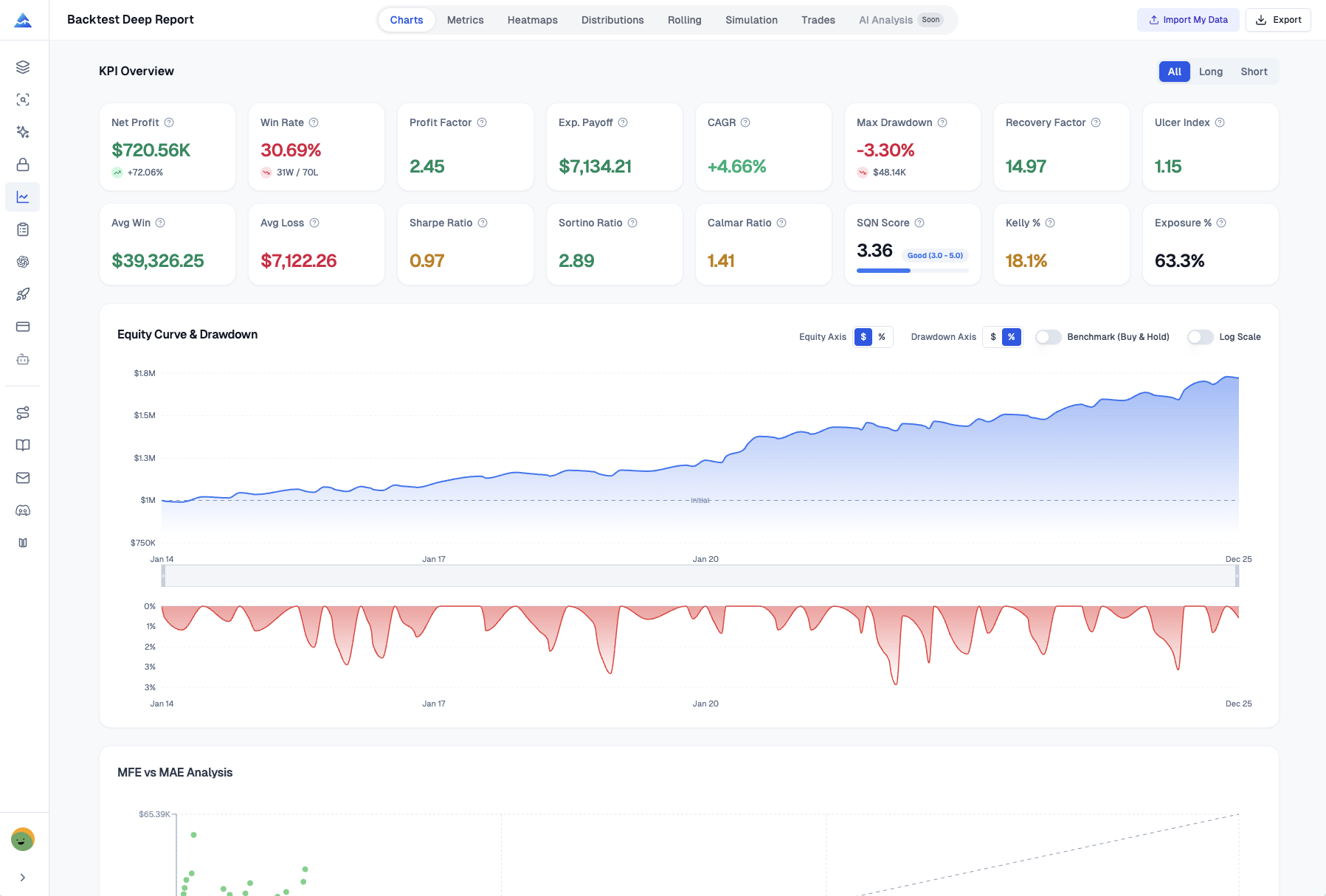
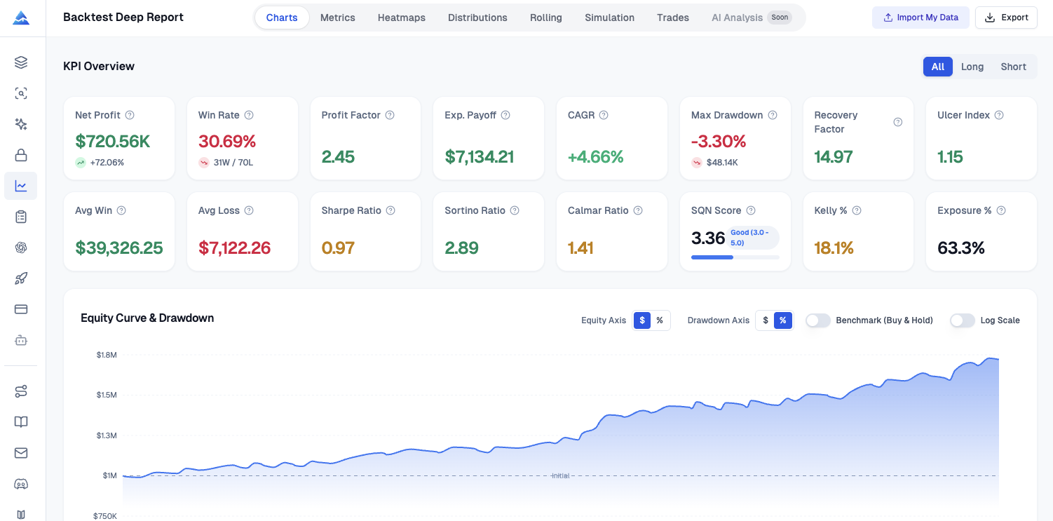
KPI Dashboard
The KPI dashboard computes Sharpe, Sortino, tail risk, and position-sizing context. It's the fastest way to answer whether returns look attractive after adjusting for volatility and drawdown pain; it aggregates classic and practitioner-favored measures in one place and supports direction filters for all trades, long-only, or short-only views.
I rely on it for Sharpe and Sortino when I want standard and downside-sensitive risk-adjusted summaries, Calmar when I care about return per unit of worst peak-to-trough pain, and SQN-style framing when I'm thinking in terms of signal quality scaled by variability. For drawdown-centric thinking, Ulcer Index and the Ulcer Performance Index (UPI, also called the Martin ratio) matter because they penalize depth and duration of underwater periods in a way that standard deviation alone can miss. On the tail side, Value at Risk and Conditional VaR (expected shortfall) help me articulate worst-case-ish scenarios in language risk managers recognize. Skewness and kurtosis round out the picture when I suspect the strategy earns its keep through occasional outsized winners or quietly bleeds through fat tails. Kelly criterion output is useful as a sanity check on aggressive sizing versus what the historical trade sample implies, not as a mandate to crank leverage.
Recovery factor, exposure percentage, and the directional filters complete a workflow I use when the same script runs mixed long and short logic and I need to verify whether one side is doing most of the heavy lifting.
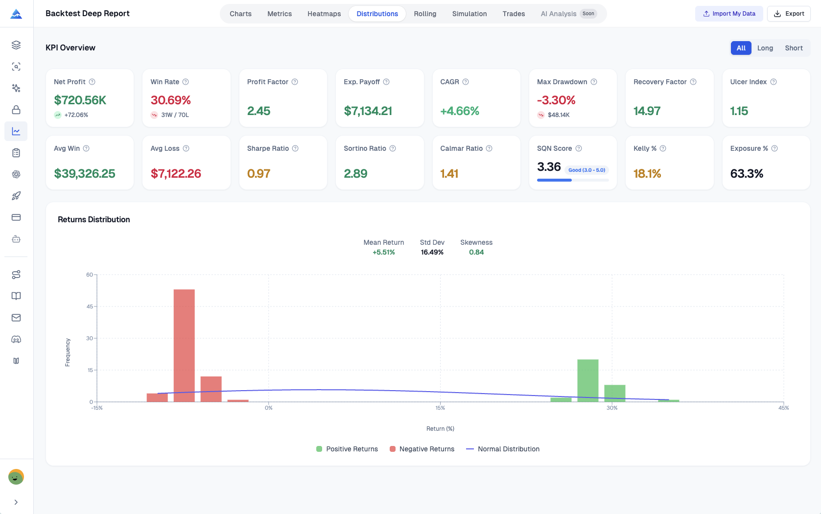
Returns Distribution
Returns distribution analysis exists because mean PnL can look respectable while the strategy quietly depends on a handful of extreme outcomes; a histogram with a normal curve overlay makes skew and fat tails visible in seconds.
In my own reviews, this tab is where I decide whether I trust the headline metrics. Color-coded positive and negative bins make asymmetry obvious. Overlaying a normal distribution gives a disciplined visual benchmark: when the empirical mass sits wider than the curve, I know tail risk deserves a heavier weight in my narrative. Reported mean return, standard deviation, and skewness save me from eyeballing alone and give me numbers I can drop next to the chart when I write up findings. If you're still learning how to validate your edge before live trading, this tab is where the rubber meets the road.

Rolling Window Analysis
Stability is a time series, not a single table. Rolling window analysis exists because stationary performance is rare; a twenty-trade rolling view of Sharpe, Sortino, and win rate turns "it worked last year" into a sequence you can inspect for decay, streaks, and regime shifts.
This is the early-warning part of my process. If rolling Sharpe drifts downward while the equity curve still looks fine, I start looking for market change, overfitting creep, or execution assumptions that no longer match reality. Rolling Sortino keeps the focus on downside volatility paths, which is often where strategies quietly deteriorate before the account statement catches up. Rolling win rate helps me separate healthy variance from prolonged cold periods that might invalidate the thesis. I have not tested this on strategies with fewer than 30 trades — the Monte Carlo bootstrap doesn't produce useful dispersion from a tiny sample, and the rolling window tabs feel sparse below that threshold.
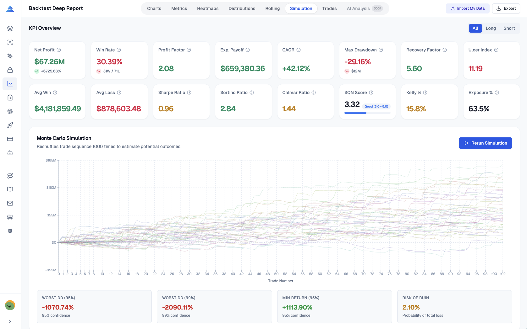
Monte Carlo Simulation
One thousand equity paths stress the trade order. Monte Carlo simulation, implemented here as one thousand bootstrap resamples with replacement, estimates how fragile your results are to reordering the same historical trades; it's the difference between hoping your backtest path was typical and measuring how wide the fan of plausible paths really is.
The visualization stacks many equity curves so you can see dispersion rather than a single lucky line. I use worst-case drawdown estimates at high confidence levels as a conversational bridge with anyone who thinks max drawdown from one backtest path is overly precise. Risk of ruin style summaries, interpreted carefully against assumptions, help me reason about survivability under repeated stress. The spaghetti chart is busy by design: it communicates uncertainty, which is the entire point.
Visual Heatmaps
Heatmaps turn timing patterns into actionable hypotheses. They exist because seasonality and scheduling effects are easy to allege and hard to prove without a matrix view; monthly, weekly, and daily return grids make concentration and dead zones obvious.
I use the monthly matrix when I want a fast scan of year-to-date contribution and whether a strategy pays during specific calendar clusters. Weekly bins across week numbers help me spot recurring macro or event cadence effects without pretending precision I don't have. Daily views add granularity when I'm investigating whether a handful of sessions dominate results. When a time-efficiency heatmap is available, it complements the calendar grids by highlighting hour-by-day interactions that intraday strategies sometimes exploit accidentally.

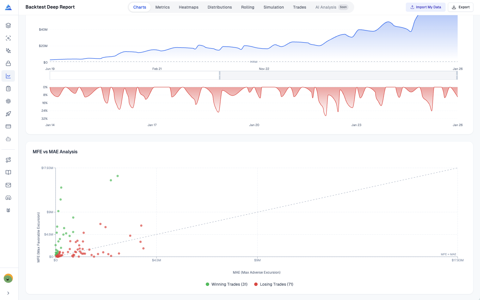
MFE and MAE Analysis
MFE and MAE scatter analysis measures where execution quality meets exit policy. It exists because every trade tells two excursion stories: how far price moved in your favor and how far it moved against you while the position was open; plotting them together reveals whether exits capture favorable movement or routinely give back edge.
Points coded by outcome make clusters readable at a glance. A reference line where maximum favorable excursion equals maximum adverse excursion helps separate trades that behaved symmetrically from those dominated by one side of the excursion. When I see winners clustering with large unused favorable excursion, I treat that as a prompt to revisit take-profit logic, trailing behavior, or partials — not as automatic proof the strategy is broken, but as a quantitative nudge where human discretion usually fails. Pairing this view with a strategy optimizer can help tighten those exits faster than guesswork.
Excel Export
Excel export matters when you need auditability, collaboration, or a second-stage model outside the browser; this workbook is organized so each major analytic slice has a home instead of dumping a single flat table.
The eight sheets align with how I already think about the report: KPI Overview for the executive summary metrics, List of Trades for the granular tape with efficiency-oriented columns where applicable, Monthly Returns, Weekly Returns, and Daily Returns for calendar views, Rolling Statistics for the time-varying stability series, Distribution Data for histogram bins and frequencies, and Monte Carlo Data for the simulated path outputs and interval-friendly summaries. One-click export is genuinely useful when I'm sending artifacts to a teammate who lives in spreadsheets, even if I prefer the interactive tabs for exploration.
How It Works
The workflow is deliberately boring in a good way: export, upload, read — because the complexity should live in the analytics, not in the logistics.
Step one is exporting from TradingView's Strategy Tester. Open the strategy on a chart, open the Strategy Tester panel, switch to the List of Trades tab, and use the export control to download the CSV that contains entries, exits, PnL, and related fields your analysis depends on. Step two is uploading that CSV into the analyzer and setting basics like initial capital and a risk-free rate defaulting around three percent so Sharpe-style metrics aren't silently mis-scaled. Step three is immediate: the tool renders the multi-tab report, including rolling analysis, distribution views, one thousand Monte Carlo paths, efficiency diagnostics, and the Excel export option, all without transmitting your file to a server because the computations stay in the browser.
Who Should Use This
Quantitative traders tend to lean on Monte Carlo, VaR and CVaR, and risk-of-ruin style thinking because their mandate is to describe outcome dispersion under resampling and tail framing. Strategy developers lean on entry and exit efficiency, MFE and MAE, and trade-level optimization cues because their mandate is to improve how signals convert into captured movement. Risk managers lean on rolling windows, Kelly-style sizing context, and Ulcer-oriented measures because their mandate is to detect decay early and speak drawdown language fluently.
I sit somewhere in the middle depending on the week, and I appreciate that the same artifact supports multiple audiences without forcing me to maintain parallel spreadsheets.
Frequently Asked Questions
▶What data sources does Backtest Deep Report support?
It works with the TradingView Strategy Tester export path. You upload the CSV from the List of Trades export and the tool maps the trade records into the analytics layer. I haven't tested it with third-party or custom CSV formats.
▶How do I export TradingView backtest data?
Open your chart with the strategy attached, open Strategy Tester at the bottom, choose List of Trades, then use the export icon to download the CSV to your computer. That file is the canonical input for this analyzer.
▶How can I go beyond basic Strategy Tester metrics?
Export the trades and run them through a second-stage analytics tool. This report adds risk-adjusted ratios, distribution diagnostics, rolling stability, resampled equity paths, heatmaps, and excursion-based efficiency views that don't fit cleanly into a single summary table.
▶How is Sharpe ratio calculated here?
It follows the standard formula: excess return relative to a risk-free rate divided by the volatility of returns, computed from the trade return series implied by your export. Sortino uses downside deviation rather than full volatility, which matters when upside variability shouldn't be treated as harmful noise.
▶What is the idea behind the Monte Carlo simulation?
The tool uses bootstrap resampling with replacement to generate many alternative orderings of the same trade outcomes, producing a distribution of equity paths. It's a practical way to ask how sensitive your historical result is to path luck.
▶Why does rolling window analysis use a twenty-trade window?
A rolling twenty-trade window is a compact compromise between responsiveness and noise: short enough to surface drift, long enough to avoid reacting to every single trade. I treat it as a monitoring lens, not a superstition about the number twenty itself. If your strategy doesn't have 30+ trades, the rolling tabs won't show much.
▶What should I look for in returns distribution?
Compare the empirical histogram to the normal overlay, then read mean, standard deviation, and skewness together. Fat tails and strong skew aren't automatically bad, but they change how confidently I translate backtest averages into real-world expectations.
▶What is the Ulcer Performance Index?
UPI, sometimes called the Martin ratio, divides excess return by the Ulcer Index. Because Ulcer Index emphasizes drawdown depth and duration, UPI speaks more directly to how painful the ride was than a pure volatility denominator does.
▶What are entry and exit efficiency metrics?
Entry efficiency relates favorable and adverse excursion to how cleanly the entry captured the subsequent range. Exit efficiency relates realized PnL to favorable excursion to show how much of the best-case movement you actually harvested by the time you flattened the trade.
▶Is my TradingView data secure when I use this?
Processing is client-side. In normal use, your CSV is analyzed in the browser without being uploaded for server-side storage, which is the posture I want when strategies are proprietary.
▶How do I export results to Excel?
After generating the report, use the Excel export control in the interface. The download packages the KPI summary, trades, calendar returns, rolling series, distribution bins, and Monte Carlo outputs into separate sheets for downstream work.
▶What sheets are included in the Excel workbook?
Expect KPI Overview, List of Trades, Monthly Returns, Weekly Returns, Daily Returns, Rolling Statistics, Distribution Data, and Monte Carlo Data, matching the eight-sheet structure.