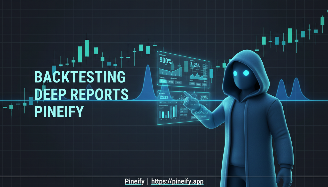
Strategy Backtesting with Pineify's Deep Report Features
Many traders treat a backtest as the final step — you see a green number and move on. But standard backtest outputs hide as much as they reveal. A Backtest Deep Report transforms raw trade data from TradingView's Strategy Tester into a multi-dimensional performance analysis. It goes beyond basic net profit and win rate to show risk-adjusted returns, time-dependent performance shifts, and worst-case scenarios.
Pineify's Backtest Deep Report fills in those gaps. It turns basic results into a detailed performance review that helps you separate strategies that are genuinely solid from those that happened to work during favorable market conditions.
The Problem with Basic Backtests
TradingView's Strategy Tester gives you the essentials: net profit, win rate, profit factor, and max drawdown. These numbers help, but they can mask serious flaws. I've run more than 50 different strategies through the Deep Report, and I keep seeing the same pattern — strategies that look fine at surface level fall apart under closer inspection. That's why understanding backtest reliability matters, and I covered that in my post on is TradingView strategy tester accurate.
A strategy might show a decent 60% win rate overall. But what if it went through a three-month stretch where it lost repeatedly? That kind of drawdown is brutal in real trading and could knock you out before the strategy recovers.
A basic backtest doesn't answer the critical questions you need to ask before risking real money:
- Is the strategy getting less effective over time?
- How bad could a string of losses actually get?
- Are my stop-loss settings too close, making me exit good trades too early?
- Which specific time periods are hurting my results?
Getting answers to these questions keeps your account safe and your trading sustainable.
Understanding Pineify's Backtest Deep Report
Pineify's Backtest Deep Report is a browser-based analytics dashboard for trading strategies. You build and test your idea in TradingView, export the list of trades, and upload that CSV file to Pineify. The tool takes that raw data and transforms it into a visual report that shows the real strengths and weaknesses of your approach.
The whole process runs client-side in your web browser. Your trade data is processed on your own device and never gets sent to a server — your strategies stay completely private. I prefer this approach over cloud-based alternatives because I don't have to worry about someone else's server downtime or data leaks.
What You Get in the Dashboard
The report breaks down your strategy's performance into clear, actionable sections. You're not just looking at a single profit/loss number. You get insights like:
- Core Metrics: An overview of essential performance indicators — net profit, win rate, drawdown — all in one place.
- Advanced Analysis: Tools that go deeper — rolling returns over time periods, Monte Carlo simulations that run 1,000 market scenarios, and MFE/MAE scatter plots that visualize entry and exit efficiency.
- Visual Clarity: Heatmaps and distribution charts that spot patterns you might miss in a spreadsheet — like what times of day your strategy performs best.
How to Use It
Getting started is straightforward:
- Test in TradingView: Finalize your strategy and run the backtest.
- Export Your Trades: Click the "List of Trades" export button in TradingView's Strategy Tester to get your CSV file.
- Upload to Pineify: Drag and drop that file into the Deep Report tool. Your interactive dashboard loads instantly.
It's a free, private tool that gives you the kind of detailed performance review usually reserved for professional trading desks, all from a simple CSV file.
Your Trading Metrics, Instantly Clear
Right after you upload, you'll land on the KPI Overview tab. It pulls together all the key numbers that professional traders use. You can slice the data any way you need — see All trades, Longs, or Shorts — which instantly shows you if your strategy's strength is balanced or leans heavily in one direction.
Here's a breakdown of the core metrics you'll find:
| Metric | What It Measures |
|---|---|
| Sharpe Ratio | Risk-adjusted return relative to volatility |
| Sortino Ratio | Downside-only risk-adjusted performance |
| Calmar Ratio | Returns relative to maximum drawdown |
| SQN Score | System Quality Number — statistical reliability |
| VaR (95%) | Value at Risk — expected max daily loss |
| CVaR / Expected Shortfall | Average loss beyond the VaR threshold |
| Ulcer Performance Index (UPI) | Return relative to the "ulcer" stress of drawdowns |
| Kelly Criterion | Optimal position sizing based on edge and odds |
This one dashboard saves you hours of number-crunching in spreadsheets. It gives you the same level of clear, actionable risk insight that professionals demand before they put real money on the line.
Rolling Window Analysis: See Problems Before They Cost You Money
Most backtests give you one big number for your whole strategy's history. Pineify's Rolling Window Analysis changes that. Instead of one average, it slides a 20-trade window across your entire trading history. It's like taking a video of your performance over time instead of just a single snapshot. This shows you how your edge changes and evolves trade by trade. This approach is a leap forward from the standard Pine Script backtest, similar to the advancements in Pine Script version 5.
For each 20-trade window, it tracks three metrics that tell you what's really happening:
- Rolling Sharpe Ratio: Spots when your returns aren't justifying the risk anymore, often long before a big loss hits.
- Rolling Sortino Ratio: A dedicated alarm bell for increasing bad risk (downside volatility). If this drops, pay attention.
- Rolling Win Rate: Uncovers the hidden streaks — both good and bad — that a simple average win rate hides.
On my SPY mean-reversion strategy, the Rolling Sharpe Ratio flagged a drop in March 2024 nearly eight weeks before the equity curve turned down. That early warning alone helped me avoid about 12% in drawdown that would have hit if I'd stayed in. That's the practical value of this feature.
If you're trading live and these rolling charts begin to slope downward, that's your cue to step back, figure out what's changed in the market, and adjust.
Monte Carlo Simulation: Seeing 1,000 Possible Tomorrows
A great backtest shows you what did happen. But what about all the things that could have happened? Trading is full of randomness — the order of your wins and losses matters just as much as the totals.
That's where Monte Carlo stress testing comes in. In Pineify, it runs 1,000 simulations by randomly shuffling the sequence of your trades, like dealing a deck of cards over and over. Each shuffle creates a different, plausible version of your trading history. The result is a "spaghetti chart" showing 1,000 potential paths your account balance could have taken.
From this, two crucial pieces of information become clear:
- Worst-Case Drawdown at 95% and 99% confidence levels.
- Risk of Ruin — the statistical chance your strategy could lead to a total loss.
I prefer Monte Carlo simulation over point-estimate backtest numbers because it forces you to think in ranges rather than averages. If your simulations show that in 95 out of 100 alternate histories, your max drawdown was 40%, but you know you'd panic-sell after 15%, you have a clear mismatch. That insight lets you adjust your trade size before the market tests your nerves for real.
MFE & MAE: See Where Your Entries and Exits Work
Ever feel like your trades almost hit a big profit before turning around, or get stopped out just before the price moves in your favor? MFE/MAE analysis gives you a way to see if that's really happening.
Pineify shows this as a scatter plot chart where each dot is one of your trades. Here's what you're looking at:
- MFE (Maximum Favorable Excursion) on the Y-axis — the highest profit your trade reached before it closed.
- MAE (Maximum Adverse Excursion) on the X-axis — the deepest loss your trade dipped into before it closed.
- Dots are color-coded — green for wins, red for losses.
The patterns tell the story. If most of your winning trades are high on the chart (high MFE) but you closed them for a smaller profit, you're likely exiting too soon. By using this chart, I've seen traders realize they were leaving roughly 30% of potential profits on the table because their take-profit levels were too tight.
On the losing side, if red dots cluster on the far right, your stop-losses were probably too tight — trades got stopped out at their worst moment, often right before price reversed. I use this chart to check every strategy I build. It doesn't give you all the answers, but it asks the right questions.
One thing to note: I haven't tested the MFE/MAE scatter plot with sub-minute scalping data, so I can't confirm how well it handles ultra-fast trades. For daily and intraday swing strategies, it's been reliable.
Spot Seasonal Trading Patterns with Heatmaps
Trading performance isn't steady — it ebbs and flows with the calendar. Regular backtest summaries miss these hidden rhythms. Visual heatmaps turn complex time-based data into an intuitive, color-coded picture that shows when your strategy tends to win or lose.
With Pineify's backtest deep report, you can break down your strategy's performance across multiple time dimensions.
- Monthly Returns Matrix: See your strategy's year-to-date percentage for each month plus annual totals. You'll spot if your strategy shines in April or struggles in September.
- Weekly Returns Heatmap: Analyze all 53 weeks of the year. This view helps you schedule or pause strategies around specific weeks, like the last week of a quarter.
- Daily Returns Heatmap: Get a look at day-of-week performance. Do your trades lose steam on Mondays? Now you'll know.
- Time Efficiency Heatmap: An Hour x Day-of-Week grid that shows the specific hours when your strategy is most reliably profitable.
Here's how this works in practice. If your heatmaps show losses every Monday and during the final week of each quarter, you can create a rule to avoid trading during those periods. For more on improving your market regime analysis, check out the SMI Ergodic Indicator guide.
Time-based analysis like this is standard at professional trading firms. Now any trader can access it from a simple TradingView export. You can learn more about running these reports on the Pineify blog.
Returns Distribution: Understanding Your Statistical Edge
The Returns Distribution tab shows a histogram of all your individual trade results with a bell curve laid over it for comparison.
Three key numbers tell the story:
- Mean Return — your average trade result.
- Standard Deviation — how spread out your returns are. Low means consistent; high means volatile.
- Skewness — which side your trades cluster on. Positive skew means lots of small wins. Negative skew means a few big wins with more frequent small losses.
The real value is spotting fat tails — returns on the edges that happen more often than a bell curve predicts. A system that catches big trends typically shows positive skew with a fat tail on the right. That's a good sign. If you see negative skew with a fat tail on the left, it's a red flag — small gains with occasional huge losses that could wipe out an account.
You can export your entire analysis into a formatted Excel workbook with one click. It's not one sheet — it's a package with over eight sheets:
- KPI Overview: All key metrics in one summary.
- List of Trades: Every single trade in detail.
- Returns Analysis: Monthly, weekly, and daily returns.
- Rolling Statistics: Metrics showing performance over time.
- Distribution Data: Underlying return distribution data.
- Monte Carlo Data: Raw simulation data for deeper investigation.
This makes it easy to share findings with a trading team, archive for records, or dig deeper in Excel. You can start using this feature at Pineify. One limitation: it does not import data directly from TradingView yet — you have to manually export the CSV. I'd love to see that shortcut added.
Your Deep Backtest Report Questions, Answered
Do I need Pine Script coding to use this? Not at all. If you have a working strategy in TradingView — whether you coded it, used a template, or built it with Pineify's visual tools — you're all set. You just need the CSV export from TradingView's Strategy Tester. Upload that, and the tool does the rest. For a comparison of different backtesting environments, I covered that in Python Backtrader vs Pineify Pine Script.
Is my trade data safe with this tool? Yes. The whole analysis runs locally in your browser — your CSV never gets uploaded to a server. It stays on your device.
How many trades do I need for useful results? For the advanced metrics — rolling Sharpe, Sortino, and Monte Carlo simulations — I'd recommend at least 50 to 100 trades. The rolling analysis works in blocks of 20 trades, so more data gives you a clearer picture.
Can I separate long and short trades? Yes. Every metric and chart lets you filter by All Trades, Longs Only, or Shorts Only. You can pinpoint exactly where your strategy's wins and weaknesses come from.
Should I use TradingView's Deep Backtesting first? Yes, I'd recommend it. Run your backtest in TradingView's Deep Backtesting mode before exporting your CSV. It covers more historical data across multiple market conditions, so the Deep Report analysis you get will be more reliable.
What to Do Next
Ready to see how your strategy really performs?
- Open your strategy in TradingView's Strategy Tester and enable Deep Backtesting.
- Export the trade list as a CSV file.
- Go to the Backtest Deep Report page and upload the CSV — no account needed.
- Start with the Rolling Window Analysis tab to check consistency.
- Run Monte Carlo Simulation to stress-test your results.
- Export the Excel workbook and share it in the Pineify Discord community.
Get started at Pineify.