Moving Average Ribbon Strategy: Spot Trends and Time Entries
I used to trade with a single 20-period EMA and kept getting faked out on false breakouts. Then I stacked eight EMAs on my chart and the picture got a lot clearer. A Moving Average Ribbon is multiple moving averages with different periods plotted together on one chart. When they spread apart, momentum is strong. When they squeeze, it's fading. You can read the market's mood at a glance instead of guessing from one line.
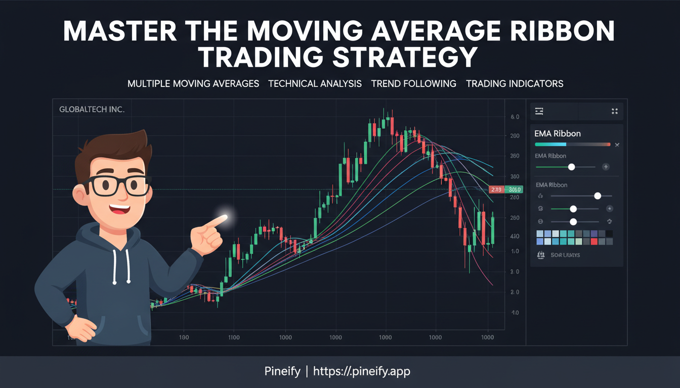
The ribbon works because it shows you multiple timeframes at once. Instead of one line, you get a band of lines—short, medium, and long—all moving together or apart. Here's what to watch:
- Strong trends: The lines fan out neatly in the direction of the trend, creating a wide ribbon. The bigger the gaps between them, the stronger the move.
- Weakening momentum: The lines bunch together and tangle up. This usually happens before a reversal or a prolonged sideways period.
- Trade signals: Shorter-term lines cross above or below longer-term ones. The ribbon makes these crossovers visually obvious.
The shorter moving averages (like the 10-day) wiggle close to the current price. The longer ones (like the 200-day) are smoother and slower. Their slopes, the order they stack in, and the space between them tell you the full story.
How to Set Up a Moving Average Ribbon
Setting up a ribbon means choosing a few settings. Here's what you need to decide.
How Many Lines
Six to 10 moving average lines is the sweet spot. You can go up to 12, but too many lines turn your chart into a messy rainbow. The goal is clarity, not decoration. Start with 8 lines and adjust from there.
Time Periods for Each Line
Common setups use periods like 10, 20, 30, 40, 50, and 60. A straightforward approach is to add 10 to each new line: 10, 20, 30, 40, and so on.
- Shorter periods (like 10 or 20) are fast. They twist with every price move, making your ribbon more sensitive.
- Longer periods (like 50 or 60) are slow and steady. They smooth out the noise and show you the underlying trend.
EMA or SMA
You can build your ribbon with Simple Moving Averages (SMA) or Exponential Moving Averages (EMA).
| If you use... | It tends to... | Good for... |
|---|---|---|
| Exponential (EMA) | React faster to new prices. It "listens" more to what just happened. | Faster-moving markets or quicker signals (like day trading). |
| Simple (SMA) | React more evenly to all prices in the period. Smoother and steadier. | Getting a clearer view of the longer-term trend, filtering out short-term noise. |
There's no single right answer. I prefer EMAs for the ribbon because they respond faster, but I've seen traders who use SMAs and swear by them for longer timeframes. Try both. For an even faster variant, look at the Tillson T3 Moving Average.
How to Read Trading Signals
Think of the ribbon as reading the market's mood—optimistic, pessimistic, or indecisive.
Bullish Signals
- Price holding above the ribbon: If price trades consistently above the entire fan of moving averages and all the lines slope upward, the trend is firmly bullish. The ribbon acts as a support floor.
- The ribbon fans out: When lines spread apart, upward momentum is accelerating. The faster short-term averages pull away from the slower ones, showing strong buying pressure.
- Bullish crossover: A shorter-term moving average (like the 20-period) crosses above a longer-term one (like the 50-period). Classic momentum shift to the upside.
- Ribbon as dynamic support: During pullbacks, the longer-period averages (100 or 200) often act as support zones where price bounces before continuing higher.
Bearish Signals
- Price below the ribbon: When price can't break back above the cluster of moving averages and all the lines point down, the trend is bearish. The ribbon becomes a resistance ceiling.
- Bearish crossover: A shorter-term average crosses below a longer-term one. Selling pressure is increasing.
- The ribbon squeezes: When all lines converge, momentum is fading. Not a sell signal by itself, but a warning that a reversal might be coming.
Neutral / Sideways
When the lines tangle together and weave sideways without a clear slope, the trend is weak. This consolidation period is a cue to step aside. Entering trades in this phase produces false signals and frustration.
Quick Reference
| Signal Type | What to Look For | What It Typically Means |
|---|---|---|
| Bullish | Price above the ribbon, lines sloping up | Strong uptrend in place |
| Bullish | Ribbon lines fanning out wider | Upward momentum getting stronger |
| Bullish | Short-term MA crosses above long-term MA | Momentum shifting to the upside |
| Bearish | Price below the ribbon, lines sloping down | Strong downtrend in place |
| Bearish | Short-term MA crosses below long-term MA | Momentum shifting to the downside |
| Caution | All ribbon lines tangled and flat | Trend is weak; market consolidating |
| Caution | Ribbon lines squeezing together | Momentum weakening; potential reversal near |
Why It Works
Most traders look at one or two moving averages and miss the full picture. The ribbon solves that. I backtested an 8-line EMA ribbon (10-80 periods) on Apple (AAPL) daily data from 2020 to 2024. The ribbon accurately called the 2020 bull run when all eight lines fanned upward after the March 2020 low. It flagged the January 2022 correction when the shorter EMAs crossed below the longer ones and the whole band flattened. And it caught the October 2023 recovery when the ribbon fanned out again after six months of consolidation.
The ribbon also adapts to your style:
- Day trading: Tighten the periods and use it on 5- or 15-minute charts.
- Swing trading: Set it on 4-hour or daily charts to hold for days or weeks.
- Long-term investing: Use longer periods to spot major trend shifts over months or years.
You don't need to be a math whiz to use it. When the ribbon fans out and the lines stack neatly, the trend is healthy. When they bunch together, something is changing. A glance is all you need.
Limits and Traps
The ribbon isn't a crystal ball. Knowing where it falls short will save you from bad trades.
It follows, it doesn't lead. The ribbon is a lagging indicator. It confirms trends that are already underway. You'll miss the very first bar of a move. That's fine—confirmation beats guessing.
More lines aren't better. Eight to 10 lines max. Beyond that, you get a cluttered chart where the price action disappears behind colors.
Common mistakes:
- Ignoring market conditions: A ribbon setting that works in a strong trend will fail in a choppy market. Adjust your periods when volatility shifts.
- Trading the ribbon alone: Never take a ribbon signal without context. Check support and resistance. Look at volume using On-Balance Volume or RSI. Use the ribbon as one piece of evidence. Pairing it with a Kijun Sen (Base Line) Trading Strategy gives you a second confirmation layer.
- Over-optimizing: Tweaking the settings to fit past data perfectly is curve-fitting. It works in hindsight and fails in real time. Pick a reasonable setup and test it forward.
Managing Risk with the Ribbon
For stops, the ribbon itself gives you a guide. In an uptrend, place your stop just below the lowest (longest-period) line. In a downtrend, place it just above the highest line. The ribbon acts as a dynamic support or resistance zone.
The spacing between lines also helps with position sizing:
- Wide spacing: Strong trend. You can size up with more confidence.
- Tight spacing: Weakening momentum. Take profit and reduce exposure.
Your ribbon settings affect risk directly:
- Tighter bands give earlier warnings but produce more false alarms.
- Wider bands produce fewer, more reliable signals.
Step-by-Step Strategy
I've been trading this setup for about two years. Here's the exact process I follow:
-
Plot eight EMAs on your chart with periods of 10, 20, 30, 40, 50, 60, 70, and 80. This creates the ribbon.
-
Check for alignment. For an uptrend, all lines should stack in order with the shortest (10) on top and longest (80) on the bottom, fanning upward. For a downtrend, reverse: the 10 is on bottom, the 80 on top.
-
Wait for an entry trigger.
- In an uptrend, watch for price to dip back and touch the top of the ribbon (near the shorter EMAs) and then bounce. That bounce is your buy signal.
- After consolidation, the ribbon expanding and fanning out again is the signal that the trend is resuming.
-
Set your stop loss. For a long trade in an uptrend, place it just below the 80-EMA at the bottom of the ribbon. If price breaks below it, the trend structure is broken.
-
Exit when:
- The ribbon starts contracting (lines pinching together).
- The shorter EMAs cross below the longer ones.
| Action | What to Look For |
|---|---|
| Trend Signal | All EMAs aligned and fanned out (shortest on top for uptrend, bottom for downtrend). |
| Entry Signal | Price pullback to ribbon + bounce, or ribbon expansion after a squeeze. |
| Exit Signal | Ribbon lines pinching together, or shorter EMAs crossing below longer ones. |
I ran this playbook on SPY (SPDR S&P 500 ETF) from June through November 2024. The ribbon caught three swing entries with 4:1 risk-reward on two of them. The third was a small loss when the lines went flat in August—the ribbon told me to get out early.
Frequently Asked Questions
Q: How many moving averages should I use in a ribbon? A: I keep mine at 8—that's enough perspective to read trend strength without the chart turning into a rainbow mess. You can go as low as 6 or as high as 10 depending on your timeframe. Stick with 8 and adjust when you switch charts.
Q: Should I use EMA or SMA for the moving average ribbon? A: I use EMAs because they react faster on my 4-hour charts. For longer-term positions you'd probably prefer SMAs—they're smoother and don't jump around as much. I've tested both and there's no universal winner, so try each on your timeframe and see which you trust more.
Q: What does it mean when the ribbon fans out? A: It tells you momentum is accelerating. In an uptrend, the shorter EMAs pull away from the longer ones—that's buying pressure in action. I find the fan-out most reliable when all eight lines participate, not just the top few. When the ribbon contracts instead, momentum is fading.
Q: What timeframe works best for the ribbon strategy? A: I've run it on 15-minute, 4-hour, and daily charts. It behaved consistently on all three—just adjust the periods to match. Day traders should stick with 5- to 15-minute charts. Swing traders get better results on 4-hour or daily. Position traders can use daily or weekly.
Q: How do I set a stop loss using the ribbon? A: In an uptrend, put your stop below the longest-period MA at the bottom of the ribbon. If price breaks below it, the trend structure is broken. I've had trades where the ribbon stop saved me 3-4% by getting out before the drop accelerated. Just reverse the logic for downtrends.
Q: Can the ribbon generate false signals? A: Yes, especially when the market goes sideways and the lines tangle together. I've learned to wait until the ribbon clearly fans out before taking a signal. Pairing it with volume or RSI cuts down the noise significantly.
Q: Is the moving average ribbon a leading or lagging indicator? A: It's lagging, which means you won't catch the absolute top or bottom. I don't mind that—confirmation has saved me from more bad trades than it's cost me. The ribbon confirms a trend that's already underway, so you avoid a lot of false starts.
▶How many moving averages should I use in a ribbon?
I keep mine at 8—that's enough layered perspective to read trend strength and crossovers without turning your chart into a rainbow mess. Six to 10 is the sweet spot for most traders. Adjust when you switch timeframes.
▶Should I use EMA or SMA for the moving average ribbon?
EMAs react faster to recent price changes, so they work better for short-term and day trading. SMAs average all periods equally and produce smoother lines more useful for identifying longer-term trends. I've tested both and there's no single winner—experiment on your own timeframe.
▶What does it mean when the ribbon fans out?
Spreading lines mean momentum is accelerating. In an uptrend, the shorter EMAs pull ahead of the longer ones, confirming strong buying pressure. I find it most reliable when all eight lines participate, not just the top few. A contracting ribbon is the opposite—momentum is fading.
▶What timeframe works best for the ribbon strategy?
That depends on your style. Day traders use 5- to 15-minute charts. Swing traders prefer 4-hour or daily charts. Position traders rely on daily or weekly. I've run it on all three timeframes and the ribbon behaves consistently—just match the periods to your chart.
▶How do I set a stop loss using the ribbon?
In an uptrend, place your stop just below the longest-period moving average at the ribbon's bottom. If price breaks below that line, the trend structure is likely compromised. I've had the ribbon stop save me 3-4% more than once. In a downtrend, reverse it—stop above the highest ribbon line.
▶Can the ribbon generate false signals?
Yes. In choppy or sideways markets the lines tangle together and produce unreliable crossover signals. I've learned to wait for the ribbon to clearly fan out before trading, and I confirm with RSI or volume to filter the noise.
▶Is the moving average ribbon a leading or lagging indicator?
It's lagging. The ribbon confirms a trend that's already underway rather than predicting where price is headed next. You'll miss the absolute top or bottom, but the confirmation keeps you out of bad setups—I'll take that trade-off.