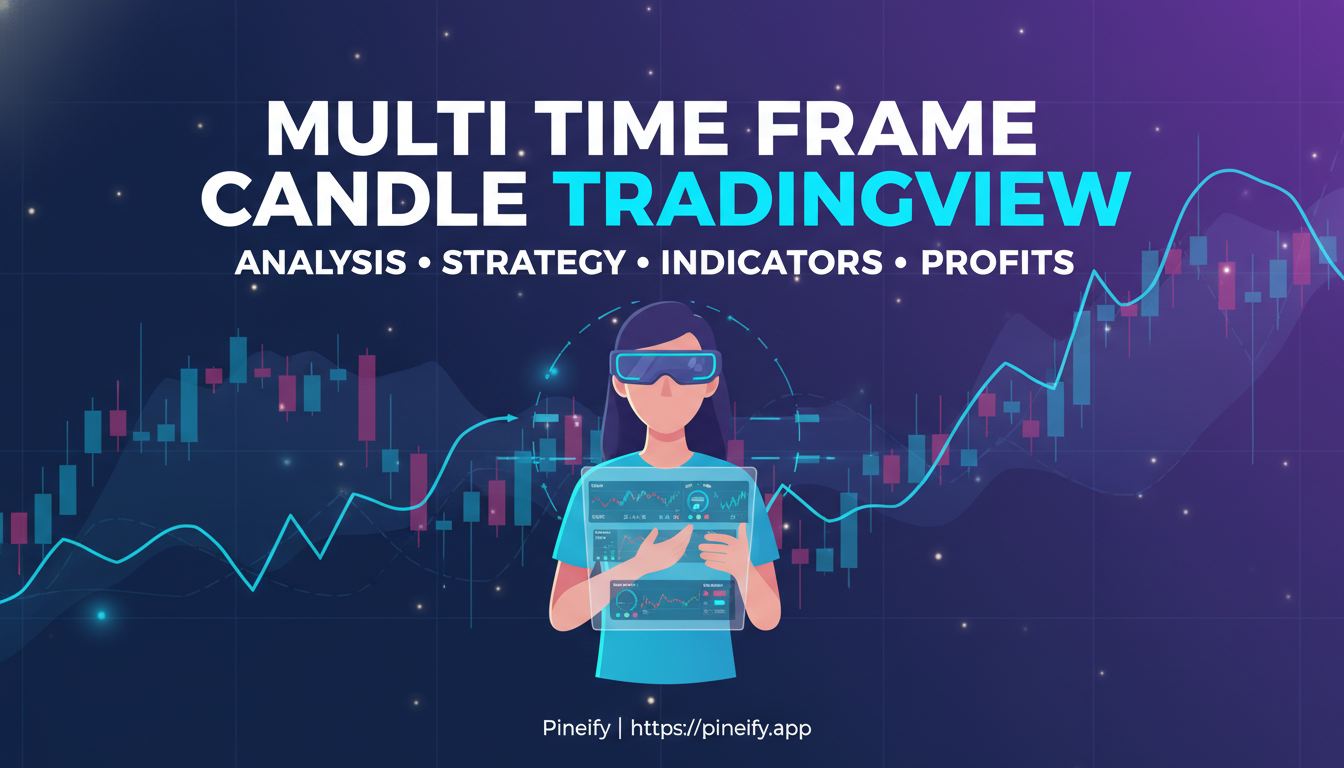
Multi Time Frame Candle TradingView: Read Higher Timeframes Instantly
Multi-timeframe candle analysis is a TradingView technique that overlays higher timeframe candles directly onto your current chart. I've been running this setup for about three years on ES futures and BTC/USD, and it filters out lower-timeframe noise better than anything else I've tried. You can watch a 5-minute chart while still seeing where the 1-hour candle is forming — no tab switching required.
Getting a Grip on Multi-Timeframe Candle Analysis
The idea is straightforward. Instead of flipping between charts, you overlay candles from a higher period onto your current one. Look at a 5-minute chart and you can see where the daily or 1-hour candles are forming in the same window. Higher timeframes smooth things out naturally. They cut through the noise on lower periods, giving you a cleaner read on the trend, support and resistance, and possible turning points.
Back in December 2024, I caught a short on NQ that I'd have missed entirely without the 4-hour candle showing a clean double top. My 5-minute chart showed nothing but consolidation. That single HTF candle saved me from a losing trade.
| Higher Timeframe | What It Tells You |
|---|---|
| Daily / Weekly | The main trend, major support/resistance |
| 4-Hour | Medium-term direction and key levels |
| 1-Hour | Short-term momentum and entry zones |
Trends exist on all timeframes at the same time. Your job is figuring out how they fit together. The daily chart might show a clear uptrend while the 15-minute chart pulls back. That pullback, inside a larger uptrend, is often the best spot to look for an entry. I've sat through too many trades where I only watched one timeframe and got shaken out. Multi-timeframe analysis fixes that.
Setting Up Multi Time Frame Candles in TradingView
You don't need to switch charts constantly to see higher timeframes. Setting up MTF candles on TradingView is simple, and once it's running you won't want to go back.
First, add a multi-timeframe indicator. Open the "Indicators" menu on your chart and search for "HTF Candles" or "Multi-Timeframe Candles." There are several community-built options. I prefer HTF Candles because it supports up to six timeframes at once and the color coding is straightforward — each timeframe gets its own body, border, and wick colors.
Once the indicator is on your chart, open the Settings panel. The key option is Resolution — that's where you pick your higher timeframe. Why use multiple timeframes? A trade that looks good on the 5-minute might be running straight into daily resistance. Seeing both prevents that mistake.
What can go wrong? If you pick timeframes that are too close together — say 5-min, 10-min, and 15-min — they'll all show nearly the same thing. You're duplicating noise, not getting a new perspective. Also, check your ATR on the higher timeframe to set stops that don't get hit by normal volatility.
You can configure each timeframe individually — minutes, hours, days, weeks. I usually run 15-min, 1-hour, and 4-hour for intraday work. If you want to build custom multi-timeframe indicators without writing Pine Script from scratch, check out Pineify's visual editor for a no-code alternative.
Market Insights with TradingView's Multi-Timeframe Tools
Getting the full picture means looking beyond a single chart. TradingView's multi-timeframe tools let you do that without juggling a dozen tabs.
Multiple chart layouts. Open several charts side by side — daily for the overall trend, hourly for entry timing. I've caught reversals on AAPL and MSFT this way more times than I can count.
Custom view options. You're not stuck with preset layouts. Day trader or long-term investor, you configure the timeframes to match your strategy.
Synchronized crosshairs. Move your cursor across one chart and the position follows on all others. Tracking exact price points across timeframes becomes instant.
Overlay indicators from higher timeframes. Instead of juggling windows, display a higher timeframe indicator directly on your main chart. Adding ADX trend readings across timeframes tells you when a move has real strength versus when it's fading.
Zoom and scale sync. Zoom into recent action on one chart and the rest follow. Keeps everything consistent so you can spot patterns across periods without re-adjusting every panel.
Advanced Multi-Timeframe Features
Some indicators go further by plotting Fair Value Gaps (FVG), volume imbalances, and other key levels from higher timeframes onto your active chart.
| Feature | What It Helps You Spot |
|---|---|
| Fair Value Gaps (FVG) | Fast-move zones where price left an imbalance — potential support or resistance. |
| Volume Imbalances | Spikes in buying or selling pressure that reveal the strength behind a move. |
| Sweep Detection | Price briefly breaks a key level then reverses — often institutional activity. |
| Midpoint Calculations | Average price points inside a range that the market tends to react to. |
These features expose institutional order flow and market structure. I haven't tested every MTF indicator on TradingView, but the ones with FVG plotting have been the most useful for my swing trades.
Reading the Market's Rhythm Across Multiple Timeframes
Watching a single chart to predict the next move is like watching one scene from a movie and guessing the ending. You miss the story. Multiple timeframes fill that gap.
A multi-timeframe view can scan six periods at once — from short quick moves to long sweeping trends. For each timeframe it determines whether the market is trending up, down, or sideways. It also pinpoints key price levels where the market has historically paused or reversed.
| Timeframe | Role in Analysis |
|---|---|
| 15-minute | Fine-tunes entry and exit timing. |
| 1-hour | Confirms the intraday direction and strength. |
| 4-hour | Captures the core swing-trading trend. |
| Daily | Reveals the primary, long-term market direction. |
| Weekly | Provides the big-picture context for all other moves. |
A multi-timeframe trend screener tracks several assets at once, using moving averages to gauge momentum across up to five timeframes. It tells you which assets show consistent momentum and which ones are choppy. When an asset trends in the same direction on several timeframes, you're getting multiple confirmations. Not a guarantee, but the odds stack in your favor.
How does this play out in a real trade? Take BTC/USD in late 2024. The 4-hour and daily charts both showed a solid uptrend, but the 15-minute dipped temporarily. That pullback was the entry. You're buying short-term noise that goes against longer-term strength.
Flip it around: daily chart screams uptrend but the 4-hour and 1-hour keep making lower lows. That divergence is a red flag. The trend might be exhausted and a reversal could be coming. I've seen this happen on SPY more than once, and ignoring it cost me.
Why Multi-Timeframe Candle Trading Works
Candlestick patterns across different timeframes give you the full story instead of a snippet. The benefits are straightforward.
The biggest advantage is flexibility. It works for day traders and swing traders alike — just adjust the timeframes.
| Your Trading Style | Typical Timeframes to Check |
|---|---|
| Day Trader | 1-minute to 1-hour charts |
| Swing Trader | Daily to weekly charts |
Another advantage is confidence. A signal on a single chart might be a fake-out. When the same signal appears on two or three timeframes, the move is more likely real. You're filtering out noise and focusing on the best opportunities.
It also helps manage risk. Major support and resistance on higher timeframes let you place stop-loss orders more strategically. You avoid getting knocked out by a minor price flicker. In March 2025, I set a stop on an AAPL trade at the 4-hour support level. The trade came within $0.30 of it before reversing. Without the HTF view, I'd have set it too tight and gotten stopped out.
Practical Applications and Trading Strategies
A straightforward way to use this is spotting a Break of Structure (BOS). Many traders who follow ICT methodology set their MTF candle indicator to a higher timeframe and watch for a structural break. Once the higher timeframe shows a clear break, it signals you to find a precise entry on the lower chart. Big-picture confirmation before you move.
Higher timeframe candles also reveal Fair Value Gaps and volume imbalances. These are fast-moving zones where price shot through without much trading activity. The market tends to remember these zones — price often returns to fill them. When you see price on your lower chart react to a higher timeframe FVG, that's a strong signal for entry or exit.
Range trading benefits from this perspective too. A higher timeframe chart shows the big consolidation zones. Drop to a lower timeframe to time your trade — wait for a breakout or a bounce off the range edges. You're not trading in a vacuum; the broader context improves your odds.
If you're serious about automating these strategies, learning to code Pine Script strategies lets you backtest and execute systematically.
Watch Out for These Multi-Timeframe Traps
Multiple timeframes are powerful. But you can misuse them. Here's what I've learned the hard way.
1. Too Many Charts
It's tempting to open a dozen timeframes. But more isn't better. Too many conflicting signals cause analysis paralysis. You can't make a decision.
The fix: Stick to three or four timeframes that match your style. I only run three for intraday work — 15-min, 1-hour, 4-hour. That's enough.
2. Fighting the Main Trend
You see a perfect buy on the 5-minute chart. But the 4-hour and daily charts show the market dropping. Taking that buy is swimming against a current. It might work, but you're making it harder than it needs to be.
Always check the bigger picture. Before any trade, glance at the higher timeframe. Make sure your trade at least acknowledges the dominant trend. I've ignored this rule and paid for it more than once — most memorably on ETH/USD in early 2025.
3. Timeframes Too Similar
15-min, 20-min, 30-min — these all show the same information with slightly different filters. You're not getting a new perspective.
Space your timeframes at least four times apart:
| Instead of This... | Try This... | Why It Works Better |
|---|---|---|
| 5-min, 15-min, 30-min | 15-min, 1-hour, 4-hour | Each chart shows a genuinely different perspective. |
| 1-hour, 2-hour, 4-hour | 4-hour, Daily, Weekly | Short-term action, medium-term trend, long-term direction. |
Q&A
Q: What's a solid timeframe setup for day trading with multi-timeframe candles? A: I start with the 5-minute chart for entries and exits. Then the 15 or 30-minute for short-term direction. I always check the 1-hour or 4-hour for the bigger trend. Three layers, no clutter. I've tried other combos but this one works for me.
Q: Does MTF analysis work for crypto? A: Yes, and maybe better than for stocks. Crypto runs 24/7 with strong trends. The method is identical but you might adjust timeframes based on how jumpy the specific coin is. In my experience, BTC/USD respects higher timeframe levels more consistently than smaller caps.
Q: How many higher timeframe candles should I show? A: Five or six of the most recent is a good start. Enough to spot structure, not so many that your screen gets busy. Adjust based on what you're comfortable with.
Q: Do I need a paid TradingView subscription for MTF candles? A: The basic multi-timeframe view works on the free plan. The catch is the indicator limit — paid plans give you more indicators, better alerts, and extra chart layouts. You can start free, but I'd recommend at least the Plus plan if you're running multiple MTF overlays.
Q: How does looking at multiple timeframes prevent bad trades? A: It filters them. Say you see a buy signal on the 5-minute chart. Before entering, check the 1-hour chart and find a strong downtrend. That misalignment is a red flag — the 5-minute signal is likely a trap. Trades are more reliable when the story is consistent across timeframes.
▶What is multi-timeframe candle analysis in TradingView?
You overlay higher timeframe candles, like 4-hour or daily, directly onto your lower timeframe chart. No tab switching. You see both periods in one window. It's the fastest way I know to check if my entry aligns with the bigger picture.
▶How do I add a higher timeframe candle overlay to my TradingView chart?
Open the Indicators menu and search for "HTF Candles" or "Multi-Timeframe Candles." Add it, go to Settings, and pick your Resolution — 1 hour, 4 hours, or Daily for example. I color-code each timeframe so I never confuse them.
▶Which timeframes work best together for multi-timeframe analysis?
I stick to timeframes at least four times apart. Day traders can use 5-minute, 1-hour, and 4-hour. Swing traders do well with 4-hour, Daily, and Weekly. Stay away from close pairs like 15-min and 20-min — they're the same data with slightly different labels.
▶Can multi-timeframe candle analysis improve trade accuracy?
In my experience, yes. When the same signal appears on two or three timeframes, you're seeing market consensus, not a random blip. It filters out false entries and gives you more confidence placing stops and targets.
▶Does multi-timeframe candle analysis work for crypto trading?
Yes, maybe more than for stocks. Crypto runs 24/7 with strong trends. The method is the same but adjust timeframes to the coin's volatility. BTC/USD respects higher timeframe levels more consistently than small caps in my experience.
▶What are Fair Value Gaps and how do higher timeframe candles help identify them?
An FVG is a zone where price shot through so fast that almost no trades happened there. It's an imbalance. Higher timeframe candles make these gaps visible at the structural level. Price tends to return and fill them. I mark these on my lower timeframe chart — they've been some of my best entry points.