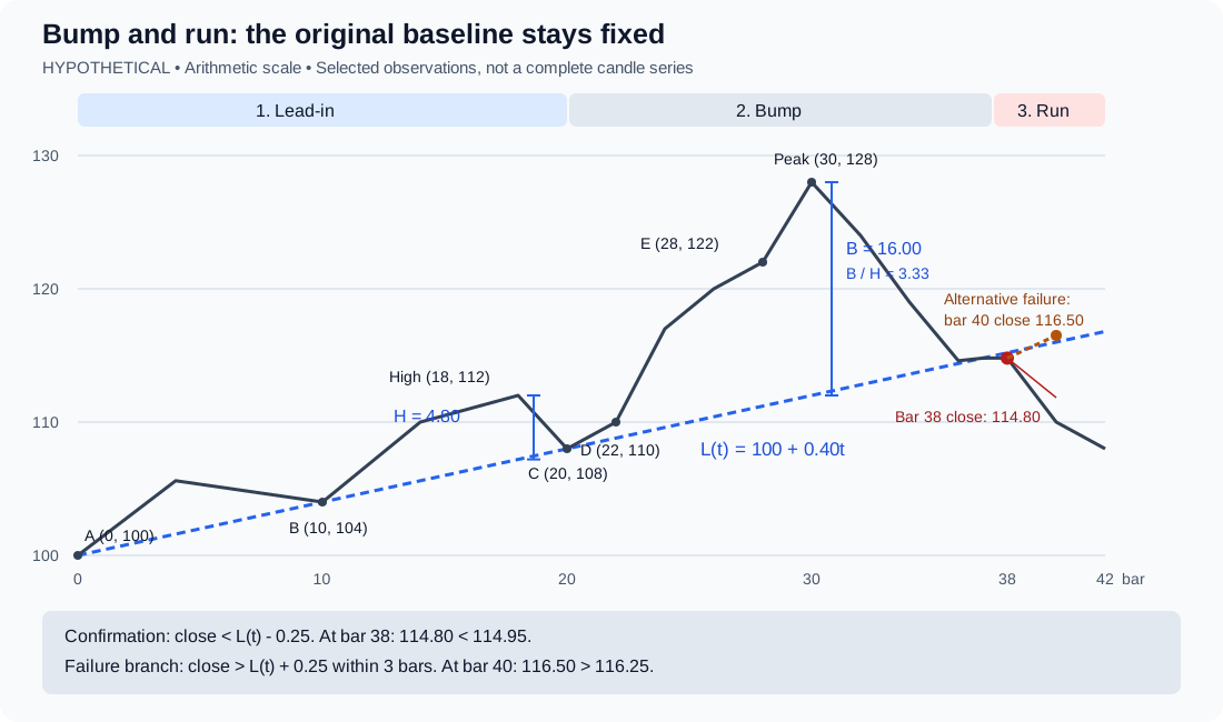
Lead-in, bump and run describe a sequence
StockCharts describes a moderate advance, a faster rise away from its baseline, and a return that eventually breaks that baseline. Its presentation uses roughly 30 to 45 degrees for the lead-in and 45 to 60 degrees for the bump, while acknowledging that angles depend on chart scale and size. It compares the bump peak with the lead-in high using vertical distance to the original line; the bump distance should be at least twice as large.
- Bulkowski specifies an arithmetic chart and a close below the rising lead-in line for a confirmed top. His current lead-in-height description uses the widest distance in the first quarter and references a price low. StockCharts uses the highest lead-in high. Record the convention: these descriptions are not identical.
- The worked example below uses the StockCharts high-to-line convention with an explicitly selected lead-in window. It does not reproduce every rule in either source.
- A bubble or speculation narrative cannot be inferred from this geometry alone. The observable claim is that price accelerated relative to a chosen baseline.
| Stage | Observable structure | What is still missing |
|---|---|---|
| Lead-in | A rising support line through separated lows | The later acceleration and reversal |
| Bump | A steeper ascent with a larger distance above that line | A completed break of the original support |
| Run | A closing break below the original lead-in line | Evidence that the decline will persist |