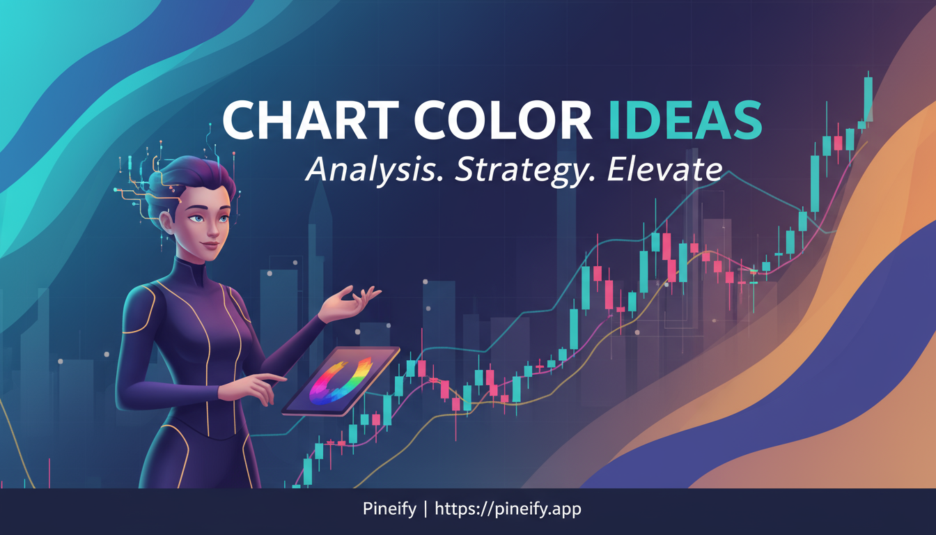
TradingView Chart Color Ideas: Color Schemes for Smarter Trading
TradingView chart color ideas are the practical color schemes and customization settings traders use to improve readability, reduce eye fatigue, and make key price action stand out. I learned this the hard way: my first year trading AAPL options, I stuck with the default bright colors and ended each session with a headache. Switching to a dark, muted palette changed how I read candlestick patterns entirely.
Choosing the right colors isn't about making things look pretty. It's about making bullish versus bearish candles, support levels, and volume spikes instantly visible. If you're a day trader watching multiple timeframes or a swing trader scanning for entries on NVDA after earnings, the right scheme directly affects how fast you read the market.
Why Your Chart's Colors Actually Matter in TradingView
The colors you pick for your TradingView charts do more than suit your taste. They directly affect how you see and understand price movement. A bad color choice can lead to misreading a chart, which is the last thing you want when you need to make a quick call.
High-contrast colors make it instantly obvious which candles are bullish and which are bearish. A harmonious palette prevents a chart with multiple indicators from turning into visual noise. I've found that a dark theme significantly reduces eye fatigue during long sessions. I've used a dark gray background with muted greens for the past two years, and I won't go back.
Colors can affect your mental state too. I prefer cool blues to stay focused, but some traders I know use warmer colors to keep energy up during afternoon lulls. On r/TradingView, traders regularly report spotting patterns faster after customizing their charts, simply because important elements like support lines or volume spikes stand out clearly. When your TradingView chart color ideas are tailored to how you work, that consistency builds intuition across timeframes.
Popular TradingView Chart Color Schemes
Ever find yourself staring at a chart for hours? The right color scheme can turn a stressful session into a manageable one. Below is a look at some of the most-loved color setups on TradingView, from timeless classics to modern, easy-on-the-eyes palettes. These ideas help the background, the candles, and your indicators work together without causing a headache.
The table below breaks down top choices, with color codes you can copy directly into TradingView's style settings.
| Scheme Name | Background Color | Bullish Candle | Bearish Candle | Line/Indicator Colors | Best For |
|---|---|---|---|---|---|
| Classic Red-Green | #000000 (Black) | #00FF00 (Green) | #FF0000 (Red) | Blue (#0000FF), Yellow (#FFFF00) | Beginners, high-contrast needs |
| Dark Minimalist | #1A1A1A (Dark Gray) | #4CAF50 (Soft Green) | #F44336 (Soft Red) | Gray (#9E9E9E), White (#FFFFFF) | Long sessions, reduced strain |
| Light Pastel | #FAFAFA (Off-White) | #81C784 (Light Green) | #E57373 (Light Red) | Pastel Blue (#64B5F6), Orange (#FFCC80) | Day trading, bright environments |
| Vibrant Neon | #121212 (Deep Black) | #00E676 (Neon Green) | #FF1744 (Neon Red) | Cyan (#00E5FF), Magenta (#E91E63) | Crypto traders, high-energy visuals |
| Earth Tones | #2E3B3A (Dark Teal) | #8D6E63 (Brown-Green) | #A1887F (Warm Red) | Olive (#827717), Sand (#F5F5DC) | Forex, natural feel |
| Monochrome Focus | #FFFFFF (White) | #757575 (Dark Gray) | #424242 (Mid Gray) | Black (#000000), Light Gray (#BDBDBD) | Precision analysis, minimal distraction |
| Cool Blues | #0D47A1 (Navy Blue) | #2196F3 (Blue) | #1976D2 (Darker Blue) | Teal (#009688), Indigo (#3F51B5) | Trend following, calming effect |
Think of these like tools in a toolbox. Classic Red-Green is your trusty hammer—simple, reliable, everyone knows it. But if you trade late into the night, Dark Minimalist is better; the softer greens and reds are much easier to look at.
For something different, the Vibrant Neon scheme really pops. It's perfect for crypto traders who want the action to jump off the screen. Earth Tones, on the other hand, gives your chart a calm feel that works well for forex pairs.
The best part is you can mix and match. Trying different combinations is the easiest way to build a chart that feels uniquely yours and helps you trade better.
How to Customize Colors in TradingView
Getting your TradingView charts to look right starts with the colors. A good scheme helps you see what the market is doing at a glance. The setup process is surprisingly simple.
Start with the Basics: The Style Settings
The quickest way to change things up is through the chart's style settings. Right-click anywhere on your chart and select "Settings." Head to the "Appearance" tab to change the main background color.
For the candlesticks or bars themselves, go to the "Symbol" section. This is where you set your "up" and "down" colors. A practical tip: make sure they contrast sharply with your background. A bright green on dark gray is much easier to read than a pale green on white.
Level Up with Pine Script
If you use custom indicators, Pine Script lets you do dynamic color changes. If you're new to coding on TradingView, check out our guide on How to Create New Pine Script on TradingView: A Quick Guide to get started.
For example, you can make a candle's color fade or become transparent based on trading volume using color.new(). A strong bullish candle starts as a solid bright green and fades as momentum slows. This kind of visual cue helps you read momentum without looking at a separate indicator.
When you're adding lines like moving averages, stick to a consistent color code. Use a dark blue for your 20-period EMA and brown for your 50-period EMA. This consistency helps your brain instantly recognize what it's seeing, no matter which stock or currency pair you're analyzing.
Choosing Your Color Palette
TradingView comes with ready-made themes like "Minimalist Dark," a popular favorite. But if you have a specific look in mind, you can input any hex color code for total control.
Once you've crafted the perfect look, save it as a template. This lets you apply it to any chart with one click, and if you're logged in, TradingView's cloud syncs your custom theme across all your devices.
Don't forget the less obvious elements. Grid lines and the price scale don't need to be bold and black. A subtle gray (like #CCCCCC) keeps them visible without distracting from price action.
If you use multiple charts on screen, a uniform color palette across all of them creates a cohesive workspace that's easier on the eyes during long sessions.
Not sure where to start? Communities like Reddit and BabyPips are full of traders sharing their own color schemes. The best practice is to test your new setup on a demo chart and see how it feels in real-time trading.
Here's a quick reference for common Pine Script color functions:
| Function | Purpose | Example Use |
|---|---|---|
color.new() | Creates a color, allows transparency | color.new(color.green, 50) for semi-transparent green |
color.rgb() | Define a color by RGB values | color.rgb(255, 0, 0) for pure red |
color.from_hex() | Use a hex code directly | color.from_hex("#2E8B57") for a specific sea green |
How to Choose TradingView Chart Colors That Actually Work
Picking the right colors for your TradingView charts is about creating a setup that's easy on the eyes and helps you spot opportunities faster. Think of it like setting up a comfortable, well-organized workspace.
Start with Readability The most important rule is that you can actually see everything clearly. Aim for strong contrast between elements like your background and price lines. Low contrast means squinting, and squinting leads to mistakes.
Avoid Eye Strain If you've ever looked at a super bright, neon-colored chart and felt your eyes get tired, you know the problem. Overly saturated colors cause strain. A balanced approach works better:
- 60% for your main background color
- 30% for secondary elements, like candlesticks
- 10% for accents, like indicators and trend lines
This 60-30-10 rule keeps things visually balanced.
Stick to a Consistent Palette Once you find a scheme you like, use it across all timeframes—whether you're looking at a 1-minute chart or a weekly one. Consistency trains your brain to recognize patterns instantly.
Dark Mode vs. Light Mode
Most traders prefer dark mode, and for good reason. It's easier to stare at for long periods.
- For Dark Mode: A black or dark gray background is your best bet. Pair it with muted greens and reds for your candles. You get the classic "trading terminal" feel without harsh glare.
- For Light Mode: If you're in a bright room, a light background can work better. Use soft pastel colors instead of bold primary ones.
Use Color Psychology to Your Advantage Your brain already associates colors with feelings:
- Green suggests growth and upward movement.
- Red signals caution and stop.
Test Your Setup in Real Life Your chart will look different on your home monitor, your laptop in a coffee shop, or your phone. I always check my colors in the environments where I actually trade. What looks crisp at night might wash out in direct sunlight.
Use Color Palette Tools If you're not sure which colors work together, use free tools like Adobe Color. Plug in one color you like, and it suggests others that complement it.
Seasonal Tweaks (It Works) This sounds quirky, but I've done it. Use cooler tones (blues and grays) in winter to help with focus. Try warmer accents (oranges or yellows) in summer to keep energy up.
By following these practices, you're building a tool that supports sharper, more disciplined trading decisions.
Advanced Techniques: Dynamic and Gradient Colors
Dynamic colors in Pine Script let you add another layer of information to your charts without extra clutter. It sounds complicated, but it makes data much easier to read at a glance.
The most useful tool for this is color.from_gradient(). Think of it like a weather map. You give it two colors—say, blue and red—and a value that moves between a high and low point, like the RSI indicator. The script blends a color between your two choices. When RSI is oversold, it shows blue; as it moves into overbought territory, it transitions to red. This is useful for creating heatmaps or adding visual layers to volume profiles without cluttering the chart.
For precision, there's color.rgb(). This lets you dial in a specific color using its RGB code (like #FF0000 for pure red). You can also add transparency (0 to 100) to any color, which is useful for layering indicators without them becoming a messy blob.
Don't build everything from scratch. Head to TradingView's public library of community scripts. You'll find pre-built "color enhancers," some of which create adaptive themes that switch between light and dark palettes depending on the time of day or market session. For more on automating your Pine Script workflow, check out our guide on Automate Pine Script Coding with AI.
You can also get inspiration from other traders. Many share setups on YouTube—sleek combinations of neon accents on dark backgrounds that are both functional and visually striking. I've tried a few myself, though I haven't tested neon schemes extensively because they don't fit my workflow. I prefer muted tones for sustained focus.
Ultimately, these techniques make your charts smarter. They transform static colors into responsive visuals that help you interpret data faster. For more on conditional formatting, check out our guide on Pine Script Multiple Conditions: A Complete Guide to Building Advanced Trading Strategies.
Common Pitfalls to Avoid with Chart Colors
Even experienced traders can trip up when choosing chart colors. More colors are not better—stick to a core set of 5-7 max. Anything more and your chart becomes confusing.
Another issue is how your screen displays color. If your monitor isn't calibrated, the vibrant colors you picked might look dull on other devices. I've been caught by this before: a scheme that looked great on my MacBook was almost unreadable on my secondary monitor.
Do your charts look perfect in TradingView but clash with your broker's platform? You can export your TradingView theme as CSS code to create a more consistent look across screens.
It's also common to stick with the default settings. But personalizing your colors can give you a real advantage. And always check your charts on your phone. Colors look surprisingly different on mobile screens, and you want your analysis to be clear wherever you trade.
By keeping these points in mind, your TradingView chart color ideas will work for you, not against you.
FAQ
▶I'm new to TradingView. Where should I start with colors?
Start with the classic red-and-green scheme on a dark background. Green up, red down—it's intuitive, and you won't strain your eyes while you learn the ropes. I'd skip neon colors until you're comfortable reading candle patterns.
▶How can I try out custom themes I find online?
It's straightforward. Download the theme from a site like ChartThemes.com, then import it through TradingView's style editor. Some themes use Pine Script for import, which I prefer because it gives more control over the result.
▶Are dark themes actually better for your eyes?
For most people, yes. I've been using dark mode for two years and the difference is significant. A dark background with softer reds and greens is much more comfortable than the default bright setup.
▶Can I make chart colors shift or use gradients?
You can, and it's a practical way to add another layer of information. Use color.from_gradient() in Pine Script to make an indicator fade from one color to another based on momentum. I use this on RSI to highlight overbought and oversold zones at a glance. For more on indicator customization, see our guide on Understanding ATR in Pine Script.
▶What color schemes work for color-blind traders?
This matters. Use a monochrome theme with different shades of gray or blue, and rely on line patterns—dotted or dashed—instead of color alone. High-contrast combinations ensure clarity without red and green. I've tested this on a few setups and found that varying line thickness helps too.