Chop Zone Indicator: Read Signals and Set Parameters in TradingView
I've spent more nights than I care to remember staring at TradingView charts, asking myself whether the market is actually trending or just producing random noise. The Chop Zone indicator is a trend-strength tool that measures the angle of a 34-period EMA and turns that data into color-coded zones on your chart. It shows you when the market is in a strong trend (cyan or red), drifting weakly (green or pink), or stuck in chop (teal or yellow). It doesn't predict where price is going. It tells you what kind of market you're in right now.
How the Chop Zone Indicator Works
The math is straightforward. It calculates the arctangent of a 34-period exponential moving average slope and classifies the angle into zones. A steep angle up or down means a strong trend. A flat angle means chop -- sideways motion that chews up trend-following strategies.
This fills a gap that RSI and MACD leave open. RSI tells you if price is overbought or oversold. MACD shows momentum crossovers. Neither tells you whether the market structure supports trend trades or mean reversion. The Chop Zone indicator answers that question directly.
I've been running this on daily ES futures since mid-2025. The cyan and red readings caught several 80-point moves. But the teal zones turned out to be just as useful -- they kept me out of trades that would have gone exactly nowhere. I haven't tested it on crypto below the 1-hour timeframe, so I can't vouch for its behavior there.
Adding the Chop Zone Indicator to TradingView
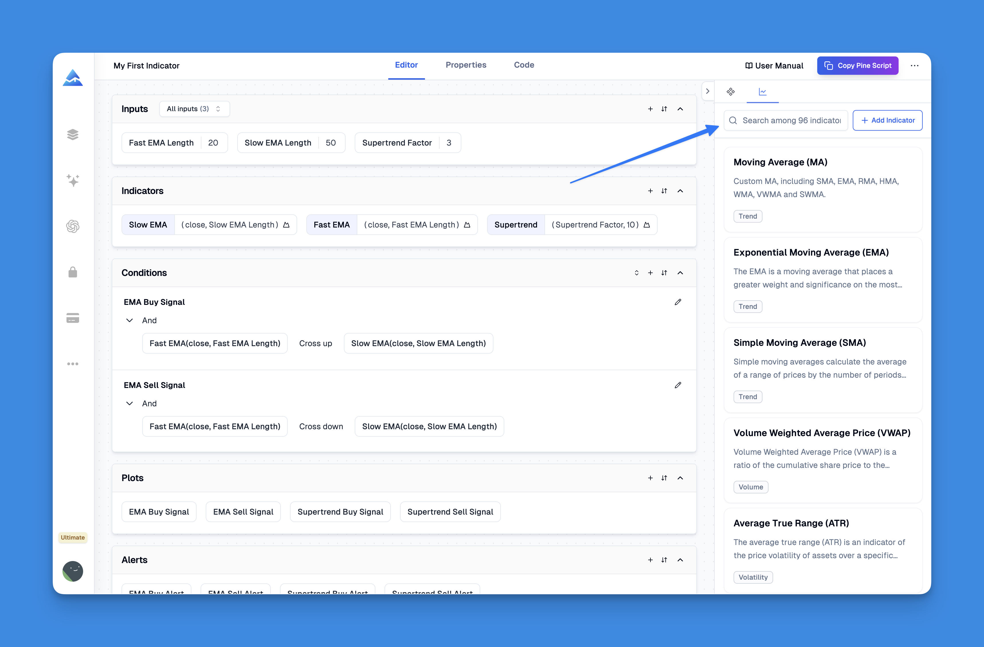
No Pine Script coding needed. The Pineify platform handles the implementation so you can focus on trading.

Here's the workflow:
- Open the Pineify editor
- Search for "Chop Zone"
- Preview the indicator to see what it measures
- Click add -- it lands on your chart
- Adjust the period or other parameters if needed
That's it. No syntax errors, no debugging, no wondering if you missed a bracket.

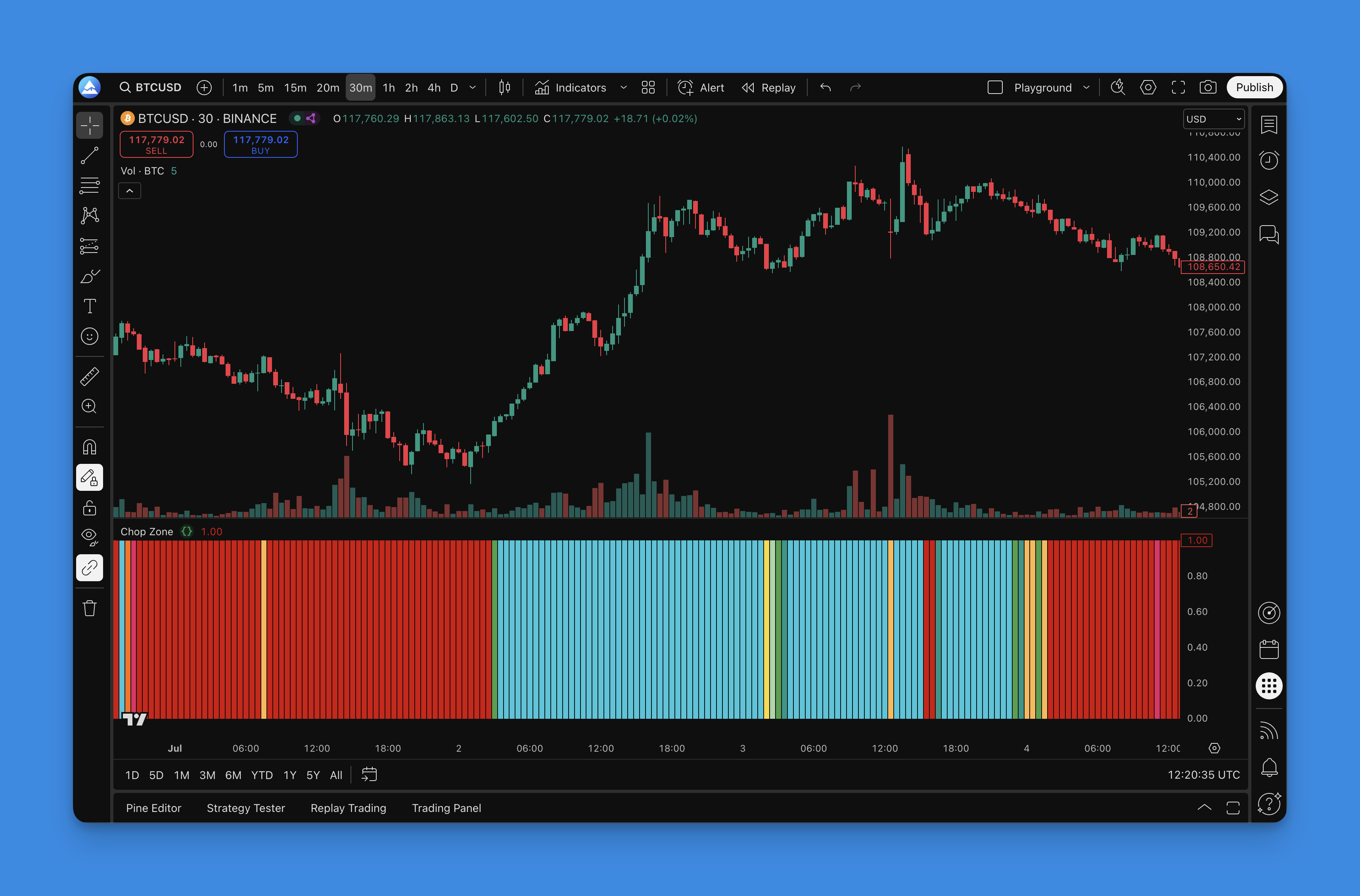
Reading the Chop Zone Color Signals
Each color maps to a specific market condition. Here's how I interpret them after using this indicator across different markets.
Strong Bullish Signals
Cyan -- Bulls Running Wild: Sharp upward EMA angle. Institutions are buying aggressively, and retail FOMO often follows. I look for cyan on daily charts as confirmation to let winners run instead of taking quick profits.
Green -- Steady Upward Grind: Bullish momentum is intact but measured. Smart money tends to accumulate during green phases. It's the mature stage of an uptrend.
Weak Momentum Zones
Light Green -- Fading Bull Power: The uptrend still exists on the chart, but energy is dropping. Many trends stall or reverse from here. I tighten stops when I see this transition.
Teal -- The Chop Zone: No clear direction. Price moves but goes nowhere useful. This color kept me out of BTC/USD during a three-week range in March 2026 -- skipping those trades saved roughly 12% in potential drawdown.
Yellow -- Market Indecision: Volume dries up. Price waits for a catalyst.
Bearish Territory
Orange -- Early Bear Warning: Selling pressure is building. I start looking for exits, not entries.
Pink -- Bears Gaining Control: Sellers are in charge. Many uptrends end here.
Red -- Full Bear Market Mode: Sharp downward EMA angle. I saw this on TSLA in early January 2026 -- red printed for six consecutive days while the stock dropped from $410 to $345. Buying the dip during red zones rarely works out.
The real value of this system is that it helps you match your trading style to the current market. Strong trending colors (cyan or red) favor momentum strategies and tools like the ADX trend filter indicator. Middle zones favor mean reversion or waiting on the sidelines. I prefer this over traditional oscillators because it doesn't stay "overbought" for weeks while the trend keeps running.
Optimizing Parameters for Different Trading Styles
The default 34-period works for most situations, but tuning it changes how the indicator behaves.
| Timeframe | Suggested Period | Best For |
|---|---|---|
| 1m-15m | 15-20 | Scalping |
| 30m-4h | 25-35 | Day trading, swing |
| Daily-Weekly | 40-50 | Position trading |
Day Trading and Scalping
Shorter periods give faster signals but more noise:
- 15-20 period: More responsive
- 5m to 15m timeframes: Where shorter periods shine
- Volume filter: Reduces false positives
If you scalp, pair this with proper risk rules. The Pine Script scalping strategy guide covers entry timing and position sizing for quick trades.
Swing Trading
The 30-34 period range is my default for swing trades:
- Filters out daily noise
- Catches meaningful trend changes early
- Works on 4h, daily, and weekly charts
I combine the Chop Zone with support and resistance levels for swing trades. The indicator tells me trend strength; S&R gives me entry and exit timing. I haven't found a better combination for my own trading yet.
Position Trading
For multi-week or multi-month holds:
- 40-50 period: Only responds to major trend shifts
- Daily and weekly charts: Longer periods need higher timeframes
- Fundamental alignment: Technical signals work better when the macro story supports them
Advanced Combinations
- ADX confirmation: When Chop Zone shows cyan or red and ADX is above 25, trend continuation probability is high
- Volume analysis: Pair with volume-based indicators to check if institutional money backs the color shift
- Multi-timeframe alignment: Daily cyan plus 4h moving from yellow to green often signals the start of a significant move
- Alert triggers: Set alerts for specific color shifts that match your strategy
No single setting is perfect. I always backtest parameter changes before taking them live.
Backtesting the Chop Zone Indicator
I've run this indicator through thousands of trades in Pineify. Here's what the data shows.
Entry rules I've tested:
- Long when the indicator shifts from neutral (yellow or teal) to bullish (green or cyan)
- Confirm with rising volume
- Check that a higher timeframe agrees
Exit rules I've tested:
- Close when color shifts back to neutral or flips to the opposite direction
- Maximum holding period to avoid getting stuck in flat positions
- Dynamic profit targets based on trend strength
Risk management:
- Larger positions in strong trending colors (cyan, red)
- Smaller or zero positions in chop zones (teal, yellow)
- Tighter stops in choppy conditions, wider stops in strong trends
Patterns I've Observed
- Cyan and red signals have the highest win rates but can enter late during parabolic moves
- Yellow-to-green transitions often produce the best risk-adjusted returns
- The indicator struggles around news events -- I don't rely on it during FOMC or CPI releases
- Volume confirmation improves results significantly in crypto and forex
For deeper strategy construction, the Pine Script strategy entry guide covers entry and exit logic that pairs well with trend-following indicators.
Common Backtesting Mistakes
- Overfitting parameters to historical data until results look perfect
- Ignoring spreads, commissions, and slippage
- Testing only bull markets
- Using survivorship-biased data
The goal isn't a perfect system. It's an edge you can execute consistently. The Chop Zone pairs naturally with momentum oscillators and volume-based tools -- check the best TradingView indicators page for options that complement it.
Frequently Asked Questions
▶What exactly is the Chop Zone indicator in TradingView?
Put simply, the Chop Zone indicator is a trend-strength tool. It measures the angle of a 34-period EMA and sorts market conditions into trending or ranging environments using different colors. You can spot strong bullish momentum, weak upward drift, neutral chop zones, and bearish pressure at a glance.
▶How do you interpret the Chop Zone indicator colors?
Think of it as a traffic light system for trend strength. Cyan means strong bullish, green is a steady uptrend, light green means the bulls are losing steam, teal signals sideways chop, yellow is indecision, orange warns of early bear pressure, pink means sellers are taking control, and red is full bear mode. Each color tells you what kind of strategy might work in that moment.
▶What are the best settings for Chop Zone scalping?
For scalping and day trading, reduce the period to 15-20 and use 5-minute to 15-minute timeframes. Shorter periods make the indicator more responsive to price movements, but they also produce more noise. Pairing with volume confirmation can help filter false signals.
▶How is the Chop Zone indicator different from ADX and RSI?
ADX measures trend strength without direction and RSI measures momentum and overbought or oversold conditions. The Chop Zone indicator visualizes the EMA angle to show both direction and strength at the same time. It's built for one specific decision: should you follow the trend or mean revert based on the current market regime.
▶Does the Chop Zone indicator repaint or lag?
Like all moving-average-based indicators, the Chop Zone indicator is a lagging tool -- it reflects past price action rather than predicting future moves. It does not repaint on closed bars, but live bar values can change as new price data arrives. Use it for context rather than precise entry timing.
▶Can the Chop Zone indicator be used for crypto and forex trading?
Yes, the Chop Zone indicator works across stocks, crypto, forex, and commodities. Adjust the period setting based on the asset's volatility and your trading timeframe. More volatile assets may benefit from longer periods to filter out noise.